LibreOffice Podcast, Episode #2 – Design and UX in Free and Open Source Software

Heiko Tietze from LibreOffice’s Design community tells us about UI and UX improvements in the suite, how decisions are made, and more. (Also available on PeerTube).

Please confirm that you want to play a YouTube video. By accepting, you will be accessing content from YouTube, a service provided by an external third party.

YouTube privacy policy

If you accept this notice, your choice will be saved and the page will refresh.

Transcript

Mike: Welcome to episode two of the LibreOffice Podcast. This is our second episode. In the first episode, we talked about marketing free and open-source software like LibreOffice: some of the challenges of marketing in a competitive world, but also marketing not just a product, but a community as well – getting people to join a community.

In this episode, we’re going to talk about design and usability. I’m Mike Saunders from The Document Foundation, the non-profit behind LibreOffice. My colleague over there, Heiko Tietze, oversees the LibreOffice design, UX, UI, and usability community. They work on improvements to the software’s design, and we’ll be talking a bit about some of the recent changes and some of the challenges the design team has when working on free and open-source software.

So, last month — where are we now? We’re in the middle of March. At the start of last month, we released our new major stable release of LibreOffice 25.2, with the year.month versioning system, with a bunch of new features and changes as well, but quite a few on the design and user-interface side. So, Heiko, what are some of the most notable design- and UX-related changes in 25.2?

Heiko: Well, it feels to me as if our release notes grow with each release. Everything, more and more is being done with every new release, and everything is great. There might be details that get implemented, fixed, and improved, but sometimes we do larger changes.

We had a couple in the last release regarding design. One that I personally like a lot is the new appearance. It started a little bit – many years ago with Personas. Persona was a term coming from Firefox Mozilla Persona, and we picked it up and provided a similar way to customise the appearance of the program by adding an image to the background, by changing the colour gradient. Then Mozilla changed the way Personas worked and broke our implementation. Someone fixed it; Mozilla changed again, and it broke again. So it was annoying over the years. This feature was not working at all.

They also implemented some dark mode to make the application work in dark environments. It was a kind of hijacking, another way to customise the application, so it switches the background anyway. Long story short: a lot of ways to change the appearance of the application, the look and feel, and to make it blend into the operating system or to have it not blended, whatever you like. In the last release, this was merged together into one way of modification, of customisation.

The basic idea behind it – which I personally like a lot – is that we relieve users from changing the very details and let them pick some broader options. In this case, it is an extension. I like extensions — something that everyone, every individual, can help us with, can support LibreOffice with, can help the community with. It needs, in this case, just to fiddle around with RGB values, create an XML file, package it into the proper format, and share it on our application extension site. The application itself can load it, and you can change the appearance of the application. Great feature. I like it a lot. People believe it is not much needed and we should focus on more important parts.

I have another feature, if you want me to talk more, something that is probably even more controversial. Well, LibreOffice has grown from StarOffice, OpenOffice, and whatnot into LibreOffice over 30 years and even more. We have different concepts in the software, different ideas, and different people who work on it. That makes some details sometimes really difficult to understand — not only as a user; even as a developer. I’m not a developer, I’m a designer. I’m looking into the functionality. I try to verify if a feature is easy to use for the average user, something like this. But this is sometimes very difficult.

One example was the way text boundaries indicate or are switched on, and under what condition it was there. It was dependent on the non-printing characters, so the pilcrow symbol that shows up at the end of the paragraph to show the user has pressed Return to start a new paragraph. This symbol being shown or not is bound, on the other hand, to the indicator of the page boundaries, where the text ends. That’s pretty weird. There are other parts, like tables, sections, and more, that get some boundaries, all in a really strange way combined. In particular, for a table you had to go to the colour customisation to enable it.

Something that I took care of: I removed everything, put it together, put the customisation under the Tools options, Writer section, under Formatting Aids. Average users might not find it easily; a bit more experienced users hopefully do not struggle too much. Then I added one option to enable everything, and people come and say, “Oh no, that’s not going to work. It is terrible.” Partially it is. For example, the idea was that most users probably want a distraction-free editing capability of the software. You want to write down just a letter and do not care about pressing Enter twice, or about where exactly the page side — the content of the document — ends in relation to the page. That was the idea: to remove everything by default, which makes it a bit hard for tables without borders to spot.

The development was a bit — not really broken — but we fixed it. I mean, someone else took care of it, or did I? I don’t remember. In the next release, this part is fixed. So the point is: we have a lot of goodies. We are not perfect. We iterate with every release, we improve, and now it’s up to the user to tell us if it’s nice and great.

Mike: Yeah. I know there are so many different workflows, and being on social media as well for LibreOffice, I see people who, like you say, want to write a letter. They want the absolute minimum user interface. They want stripped-down, bare bones. They don’t understand why it is so complicated for the software to be able to do so many things in the background, like you were talking about.

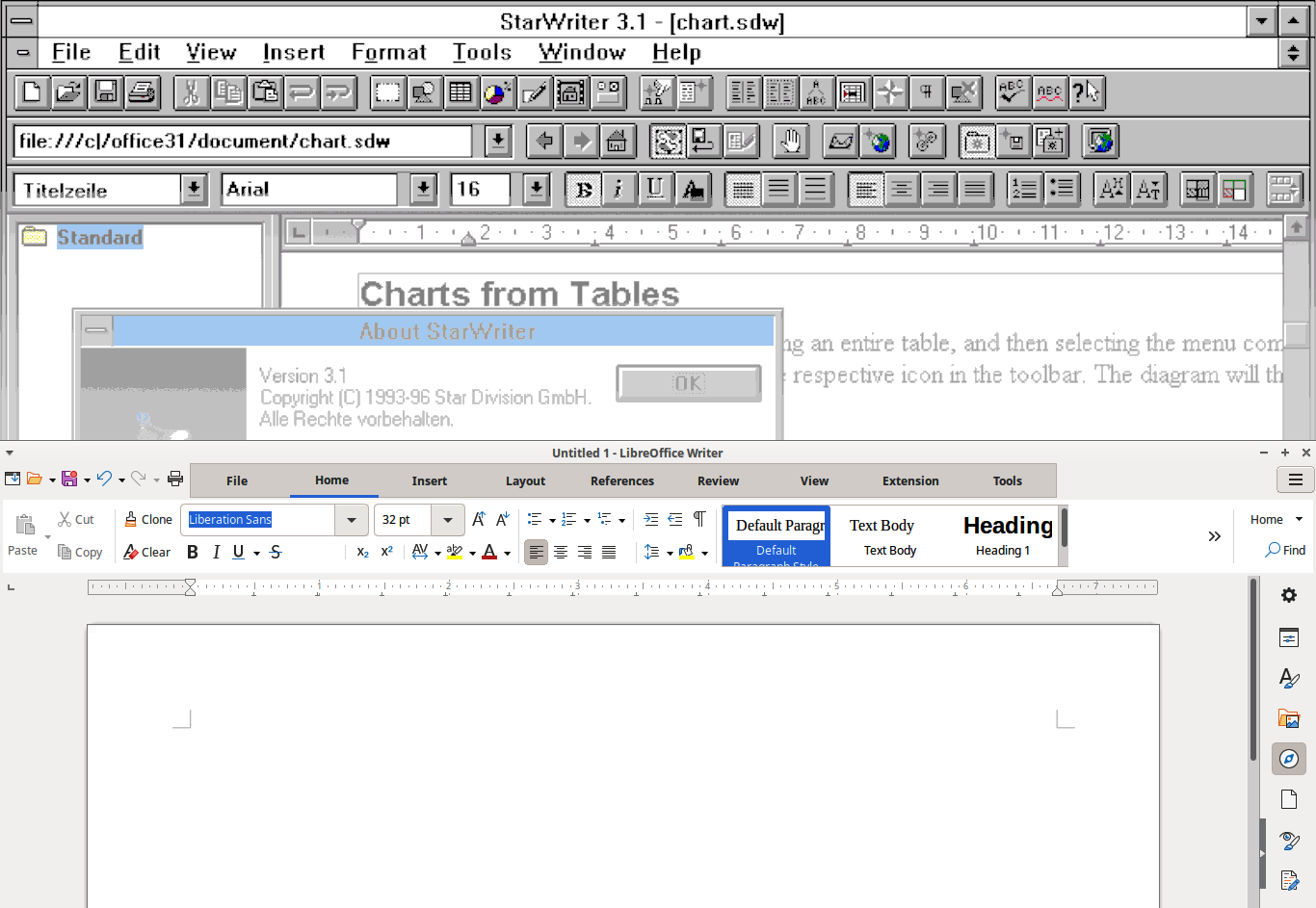
Then you have very, very more or less experienced users because, like you say, the code base goes back to OpenOffice and StarOffice before that. There were some things in the interface, in the menus, that have been there for — what can we say now? — 40 years perhaps, since StarWriter. So people have these expectations that something will always be in the same place, or the options will always be in the same place. But if you want to simplify something… It must be difficult.

Heiko: It is always hard to remove features. Adding stuff, more and more features, that’s simple. But if we remove something, for sure someone shows up and says, “Oh no, you’ll break my workflow.” But that’s well known from every application, from every tool.

Mike: Yeah, I guess finding that balance between giving people one big toggle to turn things on and off — there are lots of fine-grained controls as well. A lot of people just want one button for dark mode: turn dark mode on. Then other people want extremely fine-grained controls over every tiny element in the interface.

Heiko: That’s exactly true. I personally like simple applications that do not give you all the options by default. I think, if we stick to the office-productivity context, Google made a great application for simple workflows. You open it, you type your text, you have a few options to modify, and that’s all. I know people who really love the presentation part. I don’t know the name. Personally, I don’t understand why.

At some point, you need the ability to go beyond the basic functionality, and Google won’t help you there. You might need a different application. Microsoft Office: great application. But if you need to understand how it works, if you go even further, if you want to change something that is not done by anything else, or something very special, then you don’t have a chance with even applications that are the market leader.

Mike: Yeah. How do you make things discoverable as well? So often I see LibreOffice being used in places where people are centering text by pressing the space bar a thousand times to move a piece, and then you show them some buttons on the toolbar that are visible by default on the toolbar, and yet they don’t use them. This is not some obscure feature tucked away in an experimental mode that you have to compile a development build for. All the stuff is there, but they don’t know a lot about this. Discoverability: some things are just there in front of our eyes anyway.

Heiko: That’s a nice aspect of software. We trust a lot in icons, and users with a bit of experience in muscle memory: you always click at some point, then you know what to do. I think everyone knows an application that exactly works how it has to work, and if you change something, everything breaks. But it is not so easy to trust the icons.

We provide options to pick an icon from different themes, mostly because we want to blend into the different operating systems. You get one icon theme on Windows that has some name; you get a different icon theme on macOS, and it makes the application use and feel at home on the system. That’s one of the basic ideas of LibreOffice.

But sometimes the icon might be not enough to identify the operation. Not might: it is for sure. We have a million — okay, a gazillion — different functions and a thousand different icons, and no one can remember the different icons. I could imagine, for the centre icon, you need to very clearly take a lot of care into the small bars that identify left-aligned, centered, and right-aligned.

What we could do to solve the problem is to label all the elements. Labels are great. Labels help to understand what is going on, and you quickly read it. It is a challenge when it comes, first of all, to localisation. There are languages that take much more space than English. I mean, Finnish is one of the fun stories: it has a lot of letters to describe a simple thing, more or less. Maybe it’s the opposite sometimes. I don’t want to blame the Finnish people for their language.

But we need to take care with all the design that we do of different languages. The length of text must not change everything in the UI and make it less appealing than it is. Of course, it is the amount of functionality. It is actually possible to enable labels on a toolbar, the classic toolbar. You can show them centered next to the icon or just the label. But in this case, the number of functions on the standard or formatting toolbar — the two on top of the UI in Writer — we don’t have enough space.

We have users who run a machine with low resolution, maybe not always an old machine, but that’s one idea we have. We don’t want the user to run the latest machines and dump everything which has an age more than two years. That’s ridiculous. Ten-year-old computers should still work, and do work properly, with LibreOffice. But in this case, you have a low resolution, and to fit functions that 90% of users want to have at a certain place at the same size, that’s a bit of a challenge.

If you talk about the primary UI, we have many users who are familiar with Microsoft products and expect us to do something like a ribbon. It is maybe the next question you would ask me. This we call the NotebookBar. It’s not really a ribbon, but it looks a bit familiar. It has the opportunity to show the labels, but also trusts a lot in the icons. From my point of view, it is not really easy to use. It is just one way to deal with the UI, but not the best, I would say.

Mike: Yeah, because I remember there’s discussion about having a floppy-disc icon used for saving, for instance. What does that mean? I mean, we’re geeks who can remember floppy disks, but it’s going back a long way. Perhaps it’s become such a novelty now that people who’ve grown up without disks still associate that with saving: that weird icon, that thing I’ve never seen in real life — ah, that means saving. But then for a lot of people now, what does saving actually mean? They save into the cloud, or you have mobile devices which don’t really expose the file system.

Heiko: That was how I started to get involved 10, 12, or more years ago. I ran an analysis about icons, and it is very typical for designers to draw an arrow, and if the arrow comes from top down, it means to save. And what? Yeah, sure, it is save. No, the floppy disk is obviously a great icon and a great way to represent it.

Then it comes quickly to design questions. Now let me try to pronounce it correctly: skeuomorphism. It was the idea of macOS to make the icons appear much more like in real life: beautiful. But the zeitgeist has changed, and I think flat icons that are everywhere nowadays are generally easy to recognise still. At this point, it is an aesthetical question.

Going back to the interface, the mixture of good icons and labels, it is crucial, and perhaps a choice for the user, something where they can decide or can start off: “I’m a beginner. I don’t know the software, so I need help from the software,” which is not just Clippy. I want to read or skim over some text. That’s very quick, much faster than hovering over an icon and waiting for the tooltip to understand what it means.

Mike: Yeah, I guess the cosmetic side is one element of usability then, because I was thinking: how do you define usability? I learned Vim years ago, and then it became very usable for me, but it’s completely unusable if you’ve never come across it before. Modal editing, absolutely no feedback unless you turn on status lines and things. So some people say, “Oh, Vim is really, really usable when you know how to use it already.” But what does usability actually mean? I guess we’ve touched on it a bit with things like icons…

Heiko: Of course it goes deeper into software. The more you learn about software, the better you understand what and how to use. I have one example from Calc. As a usability or UX team, you have to analyse the user behaviour from time to time, and we ask them what features they use, how happy they are, what they prefer, and, and, and. Everything is on the blog, and even with data everything is transparent. What I’m talking about now in detail, everyone can read in the blog post.

The point is, some of these functions are well known by everyone — copy, paste. Some are less well known. If one compares the amount of “knowledge” — bad word — how well people know a certain feature, with how the other people who know it attribute importance to it, then you find easily functions that need more love, that need to be handled easier. One example in this case would be the pivot table. When you put some data, crunch it, merge it, and put it into a new table, people who know this feature cannot live without it. Others: “What? Pivot table? What is it?”

Usability is always a question of the use case, first of all: the scenario, the user. In general, it defines some kind of persona based on real data. It analyses the scenario. It requires knowing what people want to achieve and puts this together, goes back and back and round and round, and iterates again and again. But mostly it has limited scenarios. Some specialised software has a clear use case: you enter something and you want to achieve something.

Office productivity is a broad topic. People want to write a letter, or create a thesis, write a comic. They want to create some weird stuff with a wrong application, and it is not perfectly clear. In many cases, we cannot make everyone happy, or perfectly happy, and we need to focus on the majority. We are not Vi, or Vim. Vim is one dedicated program for the nerds, and LibreOffice is for the other nerds, and hopefully for not just, say, nerds.

Mike: Yeah. How do you go about actually implementing changes then? We have, in LibreOffice, the design community, and you are overseeing their work. I guess we have developers from the ecosystem, volunteers as well, and people in all sorts of different areas. So how does a change typically come about? Is it like somebody goes on to Bugzilla and says, “Hey, this feature I find hard to use. It was impossible to discover”? I know you have different tools and mockup tools as well. What’s a typical way that an improvement comes about?

Heiko: We take the input of users. We are actually also users, but it is not like a dictatorship. We don’t tell the users how they have to work. Input is done on Bugzilla. They write a bug report: something is broken, something does not work as expected, or they have ideas how the application can be enhanced — enhancement requests. Write it down. We typically have a conversation. We discuss it a couple of times, clarify, for example, the use case, clarify if it is backed up by some standards, the idea, if it is usable in more scenarios by different users – things like that.

We create some possible solution. That can be a mockup, which is a kind of a drawing of the resulting dialog. That often helps to understand the workflow better than just writing down, “You click here, and then it happens there.” The mockup is always a good help here. But the point is, if we change the workflow, the developer needs to understand what to do, how it affects the software, and like any other people, no one wants to read a lot and try to replicate mentally the other side. Here, look at a picture.

We have a couple of companies around the ecosystem who do a lot of really great work and share their work with the open source community on LibreOffice. But we also have volunteers. We have many volunteers who do it in their spare time, and everyone is welcome — to point that out very much clearly, everyone is welcome. It makes the software great. It makes the project great. We can talk about this later.

The thing with this development is that one needs a lot of time to understand the code. It has many millions, 10 million lines of code. Once you understand a little bit of the structure, or you get help, it is not so difficult to read the code. Some parts, like Calc, are almost art: beautiful to read and beautiful to understand and easily combined. Other parts are a bit more complex, to say it politely.

We have students who take the time to understand the code and implement larger pieces. That’s often done and sponsored by Google Summer of Code. We’ve participated in the project since it was started. For example, the appearance project was one of the Google Summer of Code students, who, by the way, was hired – or now he is an intern — at one of the companies in the ecosystem. We have almost every year students that are convincing the companies to hire them. So it’s not just the money that Google pays for the student; it is not just the fun to do something for millions of users and to realise something. Writing code is a great thing, to get something really done and to make it nice – but it’s also a chance to put it on your CV and even to get a job.

Mike: Yeah, we’ve used this from the marketing side before, to encourage people to join the project and get involved in LibreOffice and open source, because traditionally free software community marketing has been: join a project because, you know, we’re all working on this nice thing together, and it’s nice for you and nice for the world. But I think it’s worth pointing out some of the more personal benefits as well.

So you join the LibreOffice design community, you make a change to some element of the interface that goes out then to tens of millions of users who will benefit from it. Some people will be annoyed by it, whatever any kind of change, but you’ve had an impact. Then, like you say, you can put that in your CV and say, “My work is now being used by millions of people.”

Heiko: Yes, that’s a point. It’s not just us, TDF, like you and me. We don’t dictate anyone what to do. It is an open source project in the very basic sense that you do open source: you, as a user, want a feature? Implement it. We help; we make it possible. My contribution is to warn users to do nothing in a very complicated way, to not add much on the primary UI, to consider the users, maybe accessibility, localisation. But no one stops anyone to request a feature, to get in contact with the developers, to discuss with experts about the software.

If you compare this with commercial products, you have no way to talk to the design team – to the leader of the design team. You don’t even know who it is. In LibreOffice, you get it. It is pretty easy to get in contact with the CEO, if there was one. For the development, there is no CEO, but even in development, we have some kind of a committee, people that come together and talk about development. Design is close to development, so I’m part of this committee. It is open for everyone. People can join and can ask questions, and that’s something that we encourage users.

From the design team, or the design aspect, it is pretty easy for me to make proposals. It is tagged on Bugzilla as EasyHack, skill design, difficulty beginner – so it means it is easy to implement, it is something that affects the design, and it is for beginners. In this case, many of these changes are just labels, and changing a label does not require any knowledge in programming. People need to understand how computers work. It is not really bad to understand what Git is, but in the end you don’t even need Git for a label change. There are different ways.

You may want to talk to other people who can explain it better than me, but the actual change, as you said, where you can make an impact – the entry hurdle for this is very low. There’s no big barrier. It goes step-by-step further and reaches quickly a point where you need more expertise, that’s for sure.

Mike: I think you talked about the transparency as well, and the fact that it’s all in the open. I think it’s interesting because, although I’m not really involved in design, I’m browsing around Bugzilla and keeping eyes on different parts of the projects, and I often see quite intense discussions going on in the design team about what to do about something. Then some people might think, “Wow, look at that from the outside. Look at this big discussion, even this argument they’re having.” But those same discussions and arguments happen inside the closed companies – it’s just you’ve got no idea.

So people have no idea what they’re talking about. I was reading today rumours of Apple radically changing the design of iOS in the next release, but we don’t know anything. We can’t read their discussions. We have no insight into the decisions they’re making and why, even if you agree or disagree with them. So I think having it in the open, people say, “Oh look, they’re arguing about something. They’re having a big argument about it,” and not just in design but in QA and stuff. But I think that’s fine. That’s great. It’s there, and then anybody can join in and “add their mustard”, as we say in German.

Heiko: Yes, that’s very German: “add your mustard”. I’m pretty sure the big companies base their decisions on user data, user input, surveys, but they don’t tell you exactly what is done. They don’t tell you how they analyse data. The amount of work is likely also so huge I guess they analyse data from thousands of people in many different ways before they do the big decision, the disruptive change in the software, for sure.

We don’t do it at this large scale. Maybe we do it similarly, but we don’t reach everyone in the community. We typically reach only the people who are interested in participation, who read on social media what LibreOffice is doing, who follow LibreOffice channels, where you multiply and share the invitation to a poll, to a survey, and even then, not everyone is eager to spend 10 or 20 minutes on a survey, answering some weird questions. Yes, that’s something that we cannot solve as an open source project. We cannot do it. But what we do is to tell people why we do something, what exactly we do, and how the results are.

One more example why it might be helpful: I do my data analysis with R, and I create graphics with R. It is a nice way, I believe, to do some — not even statistics — but data analysis. If you like my graphics, you can look into the code and learn how I create the graphics from the data. You get the raw data, what people answered, of course anonymously, and you get the code to analyse this data. Isn’t it cool? I think so.

Mike: Yeah, that’s the raw openness of it. So anybody who’s watching this and thinks, “Hey, I want to poke my nose around, have a look around, get involved in the LibreOffice design community,” what’s the best way to start? Get on IRC, Telegram, mailing list?

Heiko: Yes. The design group is everywhere. We have a special IRC channel, we have a Telegram group, and we have a Matrix room. There are bridges between Telegram and IRC, and Telegram and Matrix, so the chat systems understand each other if the bridge is running well. Most people are on Telegram. It’s a convenient way and simple.

There is a mailing list that reaches out to a couple of hundred people who are registered on the mailing list. It has not much traffic. It mostly has the announcements for the meetings — it changes between Wednesday and Thursday — so we have meetings every week. One week is meant for people from the West, and the other week meant for people from the East, and everyone is welcome to join the meeting. I announce in advance the topics. It comes from Bugzilla – input from users where I cannot do quick replies or where I feel my reply would be a bit premature. It would be too quick if I think it is not needed to do a request and resolve a ticket, and people put a lot of effort into writing down their wishes. At least we should talk about it sometimes.

Participation in the Design group is possible on the chats. People can just hang out in our chats and read what people write. They can participate in the meeting or just listen to what others talk about. They can comment on Bugzilla. This is very much welcome. That is the first and most important way to contribute to user experience and design: comment on tickets or even maybe make proposals on Bugzilla.

Everyone can tag a ticket to be relevant for the UX group. There’s a special keyword, needsUXEval, that needs to be combined with a CC. A bit overly difficult, but it is possible to trigger the attention of the UX people on Bugzilla if you just want to get input, and of course doing the actual grunt work. That’s great: analysing what people said.

Mike: Yeah, and then actually doing it, because you mentioned that as well before: doers decide. We get so many questions saying, “When will LibreOffice have feature X or improvement Y?” We say, “Well, when somebody steps up to implement it.” Doers decide the project.

So, yeah, thanks for those insights, Heiko, into the way the design team works. Anything else you’d like to add before we wrap up?

Heiko: Well, no. I’m glad to do the work. I’m happy to welcome everyone else, and if I can convince people from using LibreOffice, from going into the open source world to use open source, then my job is perfectly done, I think.

Mike: Pretty much all of us in the LibreOffice project agree with that. Having lots of users is really nice, but having lots of contributors is even better as well – to have a nice active community.

So thanks, Heiko. Thanks, everybody, for tuning in. Keep an eye or ear out for the next episode, episode three. Not sure what it will be about yet, but we have lots of other projects, sub-projects in LibreOffice to talk to as well, like QA, documentation. So let’s see what comes up next. But thanks, everybody, and bye-bye.

Heiko: Bye.

Updates on Schleswig-Holstein moving to LibreOffice

German state moving 30,000 PCs to LibreOffice

Nearly a year ago, we posted about the German state of Schleswig-Holstein’s plan to move 30,000 PCs from Microsoft Office/365 to LibreOffice.

Now, Stephane Fermigier from EuroStack – which promotes European technological sovereignty and open source – has posted an update, citing an article in the German c’t Magazin. It discusses various reasons for the migration to LibreOffice and Linux, including:

  • Digital Sovereignty – Schleswig-Holstein is actively reducing its dependence on a single, non-European tech giant
  • Public Money, Public Code – Improvements made to open source software, like accessibility enhancements to LibreOffice, are available to the public
  • Public Procurement as a Lever – Schleswig-Holstein is not only improving its own IT infrastructure but also sending a strong signal to the market, potentially encouraging other public administrations to follow suit

In Fermigier’s post he also points to a recent talk from the LibreOffice Conference 2024 in Luxembourg (see below – video also available on PeerTube). Meanwhile, Dirk Schrödter, Head of the State Chancellery of Schleswig-Holstein, posted some thoughts on LinkedIn, including:

This is not just about technological independence but also about economic aspects. At present, our administrations and businesses are trapped in a system characterized by monopolistic structures and high licensing fees. […] It is a core responsibility of our state to be able to influence the operational processes of its IT systems at all times and to ensure the data security of its citizens and businesses. […] The necessary conclusion can only be: Open Source software must become the standard in our digitalized administration.

Please confirm that you want to play a YouTube video. By accepting, you will be accessing content from YouTube, a service provided by an external third party.

YouTube privacy policy

If you accept this notice, your choice will be saved and the page will refresh.

LibreOffice 25.2 video – in 18 languages! 🌎

LibreOffice 25.2 is our new major stable release, with many new features. This video which shows a few of them (also available on PeerTube) is in English but has subtitle translations in 17 languages, thanks to our awesome localisation communities! (You can see their work on this wiki page.)

Join them and help to make LibreOffice, its documentation and marketing materials available in more languages.

Please confirm that you want to play a YouTube video. By accepting, you will be accessing content from YouTube, a service provided by an external third party.

YouTube privacy policy

If you accept this notice, your choice will be saved and the page will refresh.

LibreOffice is in the Google Summer of Code 2025!

GSoC logo

Everyone loves having shiny new features in LibreOffice. But how do we get them? Many are developed by volunteers and people in the ecosystem.

But another great source of new features is the Google Summer of Code (GSoC), a global, online program focused on bringing new contributors into open source software development. GSoC Contributors work with open source organisations on a 12+ week programming project under the guidance of mentors.

And we’re happy to announce that for 2025’s GSoC, LibreOffice is once again taking part!

Find out more here

New videos from the LibreOffice Conference 2024

LibreOffice Conference 2024 logo

The LibreOffice Conference 2024, held in Luxembourg, welcomed also many speakers that are involved in creating, supporting and promoting Free and Open Source Software (FOSS) in several countries.

Extending our annual conference and opening it to intervention from international organisations and institutions was appreciated change, which provided our community with additional insights as well as creating more opportunities for cooperation between the many stakeholders involved with FOSS.

The following videos represent a selection from the several tracks dedicated to topics that are complementary to LibreOffice and the ecosystem of organisations and communities that use it and support it.

Use the icon in the top-right to navigate the playlist – or see the direct links to individual videos underneath.

Please confirm that you want to play a YouTube video. By accepting, you will be accessing content from YouTube, a service provided by an external third party.

YouTube privacy policy

If you accept this notice, your choice will be saved and the page will refresh.


Links to individual videos

  • Open source as tool of trust – Mika Lauhde – Head of Technology, Delegation for CyberSpace, International Committee of Red Cross (ICRC)
  • Open source in EdTech – Thibaud Latour – Managing director at the Luxembourg Media & Digital Design Centre
  • Luxchat4Gov – Patrick Weber – Attaché – Ministry for Digitalisation