
LibreOffice 7.5 introduced a new Dark Mode, activated automatically to match your system settings. But many of you asked for a manual switch, so our Design community has implemented it for the next update – LibreOffice 7.5.1, in two weeks!
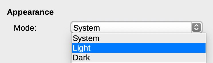
LibreOffice 7.5 introduced a new Dark Mode, activated automatically to match your system settings. But many of you asked for a manual switch, so our Design community has implemented it for the next update – LibreOffice 7.5.1, in two weeks!

Following our appearance on the Sustain FOSS podcast, Heiko Tietze from The Document Foundation talked on the sister Sustain Design podcast about mentoring designers in the LibreOffice project, and other UI/UX topics.
In late June, we started a competition to design the logo for our upcoming LibreOffice Conference 2021. We received 22 submissions with many great ideas – thanks to everyone who took part!
The conference organisers examined every design and ranked them, and today we’re announcing the winner, which is created by Alan Ward. Here’s how it looks:
![]()
Alan also provided a simplified monochrome version which can be used on merchandise – stay tuned to this blog for more on that. And here’s what he had to say about the design:
This design is inspired by the theme of a community coming together to share common experience. The hexagonal grid motif suggests networking from a technical and a human standpoint. The viewer’s attention is drawn to the LibreOffice emblem, as a focal point in the center. Colors have been chosen from a palette derived from the official LibreOffice typography, to suit both light and dark backgrounds.
Several versions of the logo have been prepared, to suit different applications. These include both full color and monochrome versions, in both hi and low resolution. High resolution printing process can reproduce thinner lines correctly (eg printed documents, PDF files). However, the use of several colors increases production costs or may not be available, so a simple monochrome may be required as an alternative to full-color. Either color or monochrome hires versions of the logo may easily be adapted as a base for a themed wallpaper.
Low-resolution printing processes such as those used to print T-shirts or engrave metal or wood articles require the use of relatively bold lines to show up correctly on the finished product. This is why a simple design with few elements is most effective in this situation. The use of several colors also increases production costs, so a simple monochrome approach is perhaps best for these applications. The monochrome design can easily be adapted for different colors of the support material (e.g. T-shirts in white, gray, black).
Thanks again to Alan for his design – a magic box of LibreOffice goodies is on his way to him! And thanks to everyone else for their submissions (we’ll get in touch and send you some LibreOffice stickers). Even though we had to choose one design in the end, there were plenty of great and creative ideas, and we really appreciate the input.
Now, onwards and upwards to the conference! Keep an eye on this blog for more updates…
(This is part of The Document Foundation’s Annual Report for 2020 – the full version will be posted here on the blog soon.)
A new Sukapura icon theme, based on Apple’s color palette as defined in macOS Human Interface Guidelines for Visual Design, was developed to become the default on macOS. The Sukapura icon theme is based on the Colibre icon theme and developed to fit macOS desktop environment in mind. (Added by Rizal Muttaqin)
![]()
The Colibre icon theme was adopted as default for the Windows operating system was refreshed based on the new Monoline style iconography implemented by Microsoft Office 365. The goal of the Monoline style is to have a consistent, clear, and accessible iconography to communicate action and features with simple visuals, ensure the icons are accessible to all users, and have a style that is consistent with those used elsewhere in Windows. (Rizal Muttaqin)
Sifr was polished and updated, with fewer icons falling back to Breeze or Colibre, while the unmaintained Tango icon theme was removed from core, but is still available as an extension. (Rizal Muttaqin, Heiko Tietze)
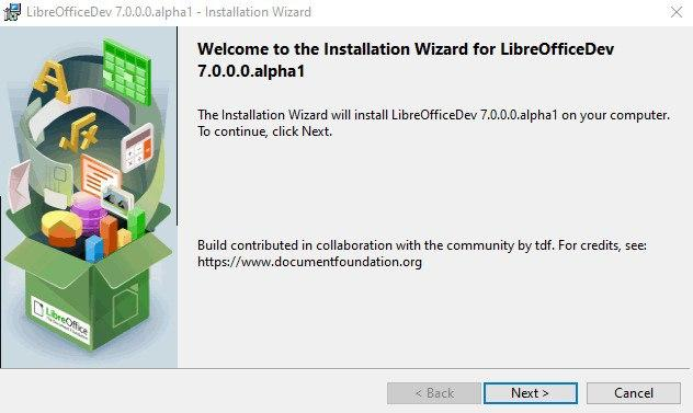
The Windows Installer was updated with new icons and images, based on LibreOffice 7.0’s visual theme. (Bayu Rizaldhan Rayes, Rizal Muttaqin, Muhammad Rivan)
The Impress Presenter Screen shows on the personal computer or laptop screen when the presentation is projected on a second screen or a projector. The screen shows both the current and the next slide, plus optionally the speaker notes, plus a timer and some presentation controls such as arrows to go back and forth.
The visual appearance of the screen was refreshed, according to the user interface design. The extra white border pixel in the box was removed as well as the blurred shadow, while the background has been darkened to make the icons in the bottom bar more visible.
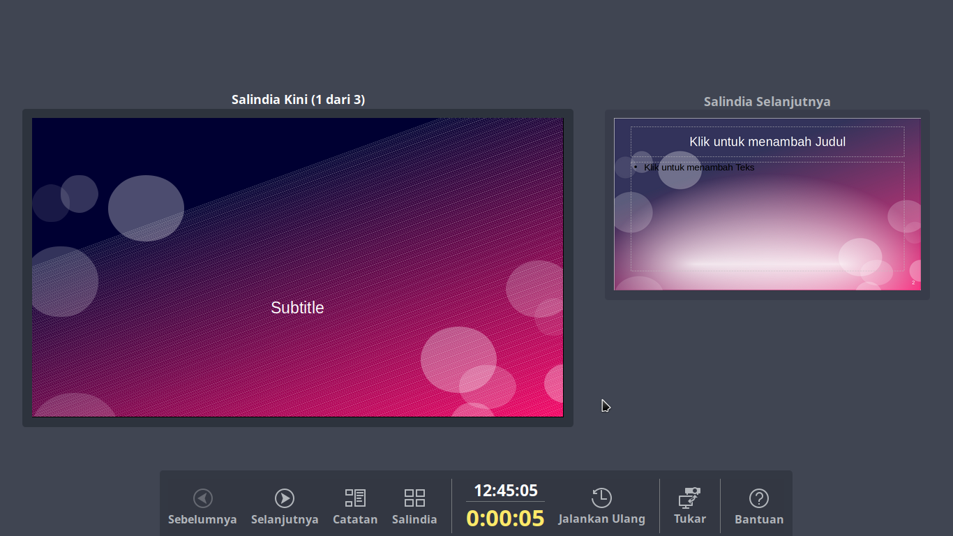
Three buttons were added: the first two to pause and resume the timer, which are useful to get the complete control on the timing of the session which was missing in the past, and a third to exit the Presenter Screen, in addition to the Esc button used in past versions. (Rizal Muttaqin)
The Elementary icon theme has been updated to be more consistent with Elementary branding colors, which are named after natural elements such as fruits. (Rizal Muttaqin)
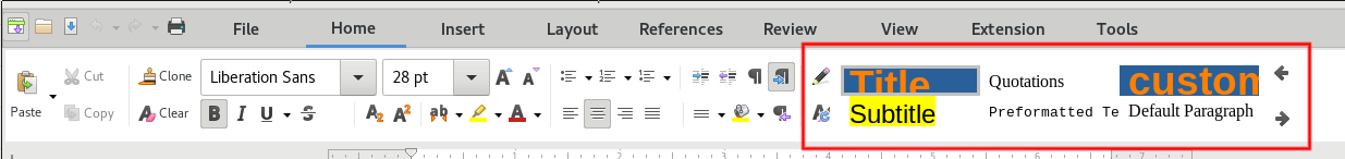
LibreOffice offers several User Interface options, from the traditional one based on Toolbars and Menus, with Sidebar, to the different NotebookBar alternatives, which are more familiar to users migrating from proprietary solutions. To help users choose the best User Interface for their preferences or habits, a new dialog window was added to select the UI during the first start. (Heiko Tietze, TDF)
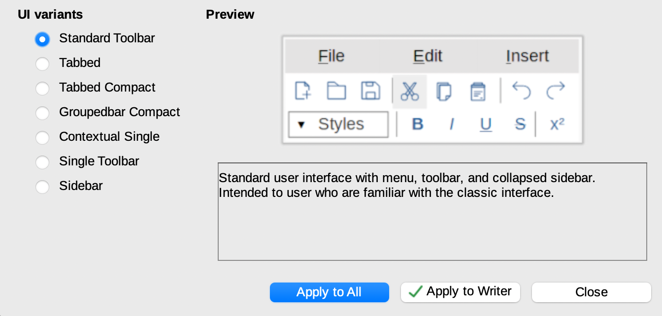
A new widget providing styles preview was added to the tabbed NotebookBar. (Szymon Kłos, Collabora)

LibreOffice 7.0, released in August 2020, includes new branding elements for the splash screen and other places, thanks Bayu Rizaldhan Rayes and the Design team. Now Barbara Tostes has made a 3D model for use in Blender, so if you want to make a video or animation about LibreOffice, check it out!
And indeed, if you make any kind of video or tutorial and want us to spread the word, join our marketing mailing list or Telegram channel and say hello. Also take a look at the Design community’s work too. We love having more ideas and feedback!
Ahmad Haris writes:
Last month, LibreOffice Indonesia held an Impress Template Contest and today we announced the results. There are several items for prizes, such as ARM Mini PC and shoes, sponsored by FANS Shoes Factory.
The main goal of this contest is to get more people active in the community, design good Impress templates, and if possible, change the old default templates with the new ones. Most of the participants are from the younger generation (since in our group, only fewer than than 10 members from 739 are older than me).
Thanks to Haris and the whole Indonesian community for their great work! The templates are available on the website here.