

Design has been one of the major focus points of LibreOffice in the last few years, and has produced new icon sets and a number of incremental updates to the user interface – menus, toolbars and the SideBar – and the creation of the brand new NotebookBar…
(This is part of The Document Foundation’s Annual Report for 2020 – the full version will be posted here on the blog soon.)
Improvements in LibreOffice 7.0
Icon Themes
A new Sukapura icon theme, based on Apple’s color palette as defined in macOS Human Interface Guidelines for Visual Design, was developed to become the default on macOS. The Sukapura icon theme is based on the Colibre icon theme and developed to fit macOS desktop environment in mind. (Added by Rizal Muttaqin)
![]()
The Colibre icon theme was adopted as default for the Windows operating system was refreshed based on the new Monoline style iconography implemented by Microsoft Office 365. The goal of the Monoline style is to have a consistent, clear, and accessible iconography to communicate action and features with simple visuals, ensure the icons are accessible to all users, and have a style that is consistent with those used elsewhere in Windows. (Rizal Muttaqin)
Sifr was polished and updated, with fewer icons falling back to Breeze or Colibre, while the unmaintained Tango icon theme was removed from core, but is still available as an extension. (Rizal Muttaqin, Heiko Tietze)
Dialogs
The Windows Installer was updated with new icons and images, based on LibreOffice 7.0’s visual theme. (Bayu Rizaldhan Rayes, Rizal Muttaqin, Muhammad Rivan)
Impress Presenter Screen
The Impress Presenter Screen shows on the personal computer or laptop screen when the presentation is projected on a second screen or a projector. The screen shows both the current and the next slide, plus optionally the speaker notes, plus a timer and some presentation controls such as arrows to go back and forth.
The visual appearance of the screen was refreshed, according to the user interface design. The extra white border pixel in the box was removed as well as the blurred shadow, while the background has been darkened to make the icons in the bottom bar more visible.
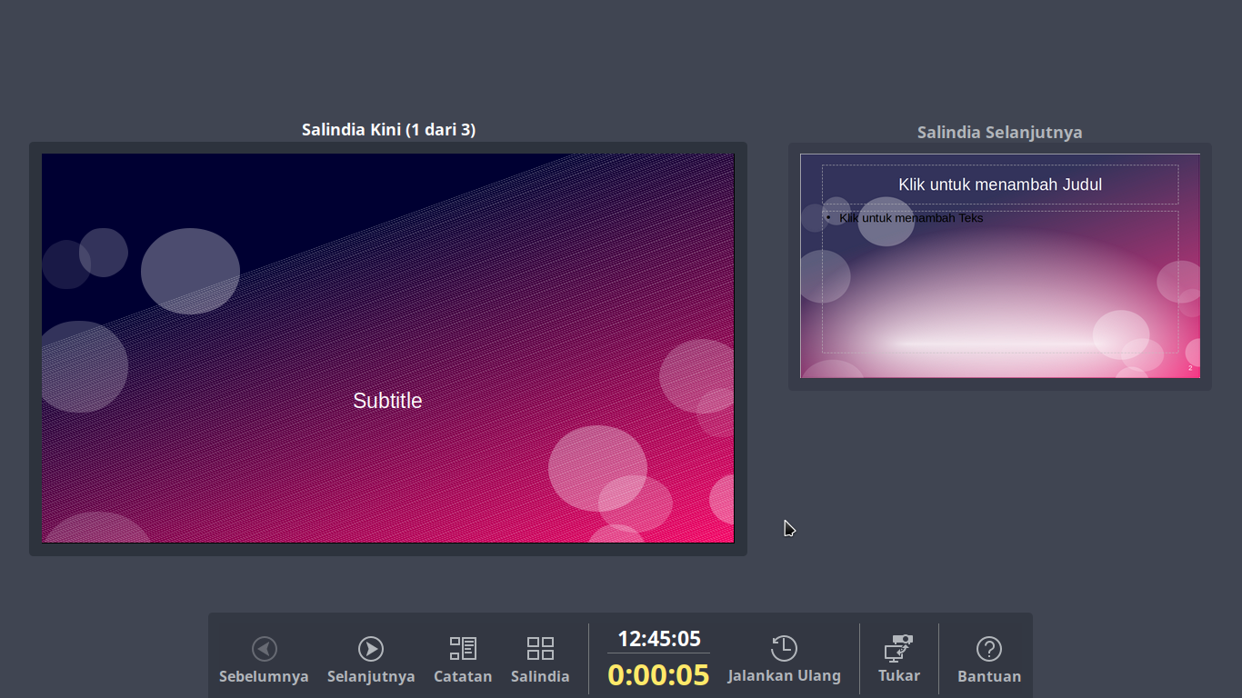
Three buttons were added: the first two to pause and resume the timer, which are useful to get the complete control on the timing of the session which was missing in the past, and a third to exit the Presenter Screen, in addition to the Esc button used in past versions. (Rizal Muttaqin)
Improvements in LibreOffice 7.1
Icons
The Elementary icon theme has been updated to be more consistent with Elementary branding colors, which are named after natural elements such as fruits. (Rizal Muttaqin)
Dialogs
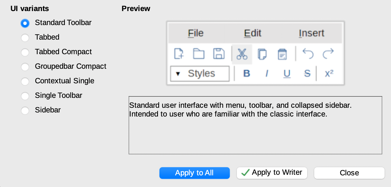
LibreOffice offers several User Interface options, from the traditional one based on Toolbars and Menus, with Sidebar, to the different NotebookBar alternatives, which are more familiar to users migrating from proprietary solutions. To help users choose the best User Interface for their preferences or habits, a new dialog window was added to select the UI during the first start. (Heiko Tietze, TDF)
NotebookBar
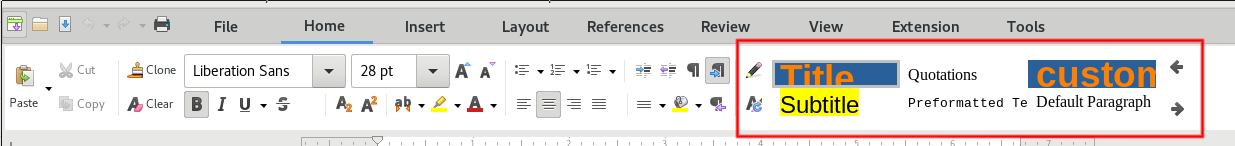
A new widget providing styles preview was added to the tabbed NotebookBar. (Szymon Kłos, Collabora)
Is the standard toolbar in maintenance mode now? No mention of any new innovation in the last two releases from reading this overview.
Is future UI/UX development primarily around the notebook bar interfaces?
Also I think that the statement below is factually incorrect, that dialogue does not start on first run, it is linked from the initial ‘tip of the day.’ If you don’t continue from there you will not see that dialogue.
‘LibreOffice offers several User Interface options, from the traditional one based on Toolbars and Menus, with Sidebar, to the different Notebookbar alternatives, which are more familiar to users migrating from proprietary solutions. To help users choose the best User Interface for their preferences or habits, a new dialog window was added to select the UI during the first start.’
Hi Anil, this is just a short summary of last year – full changes are in the release notes: https://wiki.documentfoundation.org/ReleaseNotes/7.0 and https://wiki.documentfoundation.org/ReleaseNotes/7.1
The standard toolbar isn’t going to be removed. If you think it needs some changes, you can suggest them to the Design community here: https://wiki.documentfoundation.org/Design
Noteboolbar and standard toolbar with menu bar are equal.
Both are full maintained. In addition standard toolbar is way easier to maintain.
Also LibreOffice is a community project, so maintenance mean you can help Everytime you want.
It’s a real pity not to see the names of the people who have actually contributed these features… I was eg. excited about the UI variant dialog; and it is so much encouraging to see it was a large code contribution from Heiko! Is it possible to credit the actual contributors in articles like this please?
Hi Jan, good point – we’ve added the names (and affiliations where appropriate too). Thanks!
I love the standard toolbars and the option to create my own.