ODF is just the first of the advantages of LibreOffice

Comments continue to be posted on articles that refer to blog posts on OOXML and related topics, from users who claim to support FOSS but in fact choose proprietary software, for reasons that have nothing to do with the support they claim to offer.

These users share a preference for the proprietary OOXML document format and the Microsoft 365 ribbon interface, demonstrating on the one hand incompetence regarding formats and on the other hand subservience to proprietary marketing. Some of them even use the definition of “standard” for the ribbon interface, which in reality is neither a standard nor a good example of ergonomics.

In reality, if ODF is LibreOffice’s first advantage from an open source perspective, the flexibility of the user interface is probably the second. Let’s start with an in-depth analysis of these two important advantages.

Native support for the ODF format

LibreOffice uses ODF as its native format rather than as a second choice, handled in an approximate manner with the aim of disqualifying ODF in the eyes of users, as Microsoft, OnlyOffice and WPS Office do.

This means that documents are transferred perfectly without the risk of silent data loss, formatting corruption or schema compromise. Users working in environments that require ODF compliance, such as some EU public administrations, are guaranteed maximum fidelity without any effort.

In contrast, the complexity and ambiguity of the OOXML format, combined with the gap between the published specifications and the actual implementation, make the format almost as opaque in practice as a proprietary binary format. Technically, it is possible to access XML files, but making sense of them or achieving interoperability is another matter entirely.

LibreOffice supports the ODF format natively, which eliminates the risk of vendor lock-in and ensures that documents remain accessible in the long term, regardless of the commercial choices of a private company. This is an increasingly important consideration for European public administrations, particularly in light of EU digital sovereignty policies.

Flexible and customisable interface

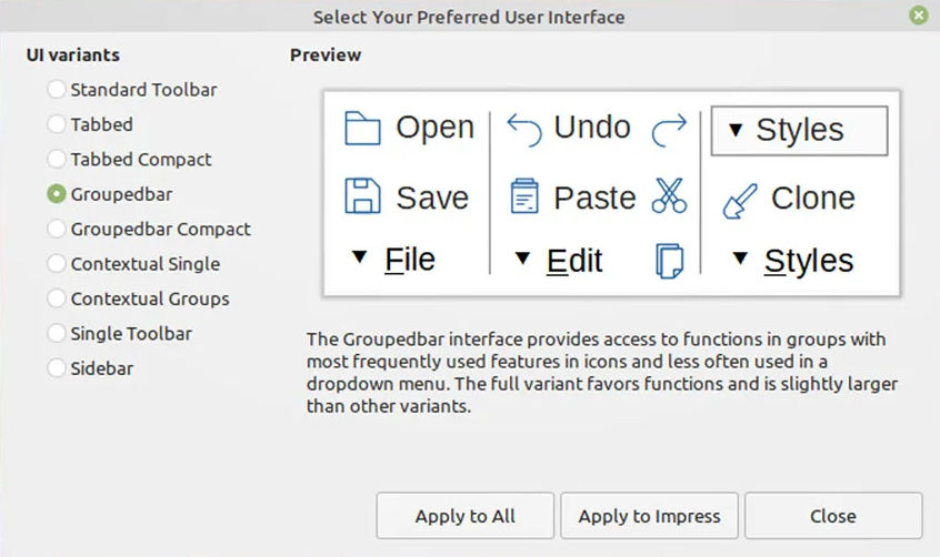
LibreOffice offers several user interface modes, which users can switch between depending on their workflow and familiarity: the classic interface with toolbar, the tabbed user interface (ribbon style, for users familiar with Microsoft 365), the compact tabbed variant, the compact grouped bar, the single contextual toolbar and the sidebar-centric layout.

Microsoft 365, WPS Office, and OnlyOffice have only one user interface, which in the first case is original and in the other two cases is a simple clone, forcing users to adapt to choices dictated in one case by patent-based protection strategies, and in the others – I suspect – by a total inability to develop an original solution.

Incidentally, the characterisation of ribbon-style interfaces as “modern” or “standard”, used by several users, is not based on any objective usability parameter or design principle, but is the result of Microsoft’s dominance in the market and the huge investments made when the ribbon was introduced in Office 2007 as a new paradigm for productivity software.

From a human-computer interaction perspective, there is no consensus that the ribbon represents superior usability. In fact, it was controversial at launch and remains so among experienced users, who often find it faster to navigate menu hierarchies, once learned, than a ribbon that emphasises breadth over depth.

LibreOffice’s toolbar and menu interface reflect decades of refinement in that paradigm, and are demonstrably more efficient for users who are already familiar with it.

The idea that “modern” equals “similar to a ribbon” is a normalisation effect: the Microsoft interface has become a benchmark because of its ubiquity, not because of its proven advantages in terms of usability. Added to this is the fact that many users evaluate office software through the lens of familiarity with Microsoft Office and consider deviation from it as a problem rather than a design choice.

LibreOffice’s multiple interface options are undoubtedly a more thoughtful response to user needs than the one-size-fits-all ribbon approach. Offering users the ability to choose their own interaction model (classic menus, ribbon tabs, or grouped and compact toolbars) is a sign of design maturity, not backwardness.

Other advantages of LibreOffice over proprietary solutions

No monetisation of users. LibreOffice has no advertising, does not profile users, has no upsells, no lock-in pressure through the cloud, and no feature gating.

More options for macros and scripting. LibreOffice retains its own Basic, and adds Python, JavaScript, and BeanShell to offer experienced users extensive automation capabilities, making it significantly more flexible and capable than other software in this specific area.

Access to source code. LibreOffice is developed under the auspices of The Document Foundation, a non-profit foundation, according to the ethical principles of FOSS, and therefore with full transparency of the source code, which allows users and organisations to verify exactly what the software does.

Data privacy assurance. LibreOffice does not collect personal data, usage metrics or diagnostic information, and offers full control over documents, which is essential for data sovereignty, with encryption options to protect files with passwords and even options to remove any type of personal information from files.

Balance between platforms. LibreOffice offers full versions for Windows, macOS and Linux that are identical in terms of features and functionality, to protect the user’s right to choose their preferred operating system, with the only difference being in the installation procedure.

In summary, for users who prioritise FOSS principles – such as standard document format, access to source code and data privacy – and are not easily swayed by proprietary software strategies for the user interface, LibreOffice is the best choice overall.

Those who argue otherwise, hiding behind baseless justifications such as interoperability and modernity of the user interface (where the real advantage lies with LibreOffice), clearly need to clarify their ideas regarding support for FOSS, which is a choice where “convenience” is not a factor.

Welcome Dan Williams, new LibreOffice Developer focusing on UI/UX

Photo of Dan Williams

The Document Foundation is the small non-profit entity behind LibreOffice. It oversees the project and community, and is now expanding with new developer roles. So let’s say hello to Dan Williams, who joins the team to work on design and user interface (UI) improvements, with an initial focus on macOS:

Tell us a bit about yourself!

I’m from the USA, have lived on both US coasts at various times, and now live back in the “midwest” where I grew up.

I was previously a software engineer, team lead, and manager at Red Hat for more than 20 years. In that time I’ve worked on a large variety of projects, from local networking to cloud networking to desktop software. I spent two years helping build the One Laptop Per Child software stack which was an eye-opening experience from a UI and design perspective. I believe passionately in free and open-source software; all the code I’ve written so far in my career is open-source.

Oddly enough, I’m not new to the LibreOffice community; I was an OpenOffice contributor and co-founded the NeoOffice port to Mac OS X (now called macOS). That led to being hired by Red Hat to package and improve OpenOffice for Fedora and Red Hat Enterprise Linux, where I helped start the 64-bit port and realize the Native Widget Framework that’s still used in LibreOffice today. I eventually handed my Red Hat OpenOffice duties over to Caolán McNamara (now at Collabora) and moved on to networking. I still recognize quite a few of our community members who I worked with before!

Outside of office software I’m the maintainer of the ModemManager WWAN software stack and I seem to have developed a hobby of collecting LTE and 5G base stations. I enjoy playing with hardware (especially if it runs Linux), baking and cooking, building large structures out of wood, and occasionally brewing beer in my basement.

What’s your new role at TDF, and what will you be working on?

A significant part of my new role will echo my early OpenOffice contributions: Mac! I’ll convert the last bits of Carbon API into modern Cocoa ones. This old code involves some pretty core functionality like popup menus and key modifier detection so it’s going to be tricky but we need to do it. Nobody knows how much longer Apple’s going to support HIToolbox but I’d like to be prepared. I’m also going to improve general Mac usability and experience; I’ve been using LibreOffice on macOS since the beginning so I’m familiar with its rough edges.

LibreOffice screenshot, running on macOPS

But the Mac isn’t the only platform so I’ll be driving user interface improvements and fixing annoying bugs everywhere else too, regardless of platform or visual backend. I also look forward to working with the LibreOffice Design community to try out new ideas and see what sticks.

I enjoy the challenge of working throughout the entire codebase, from the depths of VCL/SAL up to the UI logic and layout in the applications at the top. I’m also a big believer in automated testing and continuous integration (CI) and I hope to improve our reliability and reduce regressions. It’s often a pain to write tests for a small bug fix or any other change, but I think they’re necessary for a healthy project.

How can all users of LibreOffice help out?

What are the most annoying interface and interaction bugs, for the Mac or otherwise? Make sure they’re in Bugzilla! I need help prioritizing issues – so here’s your chance to get your favorite bug looked at.

If you’re interested in LibreOffice’s user interface and visual identity, join the Design team.

Do you have Cocoa experience on the Mac and a bit of extra time? Help me out with bugs! I’d be happy to get you started.

LibreOffice Design team work in 2024 – TDF’s Annual Report

LibreOffice comment styles

Design has been one of the major focus points of LibreOffice in recent years. The design/UX community has continued to support QA by evaluating user reports on Bugzilla, helping development with mockups, and mentoring volunteers and students in different projects.

(This is part of The Document Foundation’s Annual Report for 2024 – we’ll post the full version here soon.)

Besides a large number of fixed issues on macOS thanks to Patrick Luby, and continuous work on the Navigator by Jim Raykowski, we had many more improvements – here is just a small selection:

Improvements in LibreOffice 24.2

The column/row for active cells can be highlighted in Calc (implemented by Sahil Gautam)

Active cell highlighting in LibreOffice Calc

Tools ▸ Options was complemented by a search feature (Bayram Çiçek)

Comment styles were introduced for quick and consistent formatting of all comments (Maxim Monastirsky) (depicted in the screenshot at the top of this post)

Improvements in LibreOffice 24.8

Bundled templates were refactored with localized placeholders (Laurent Balland)

New “Quick Find” deck in the Sidebar, which lists the search results along with their context (Khushi Gautam)

Quick Find deck in LibreOffice Sidebar

Formatting characters are now treated independently from fields and do not toggle with non-printable characters (Heiko Tietze)

“Keep Ratio” settings in the Position and Size dialogs are more intuitive now with a lock symbol and reference lines (Heiko Tietze)

Hovering over a layer’s tab in Draw highlights the objects it contains (Jim Raykowski)

Among many other improvements to the Basic IDE, a dialog was added that allows users to pick one of six syntax highlighting colour schemes (Rafael Lima)

Like what we do? Support the LibreOffice project and The Document Foundation – get involved and help our volunteers, or make a donation. Thank you!

LibreOffice Podcast, Episode #2 – Design and UX in Free and Open Source Software

Heiko Tietze from LibreOffice’s Design community tells us about UI and UX improvements in the suite, how decisions are made, and more. (Also available on PeerTube).

Please confirm that you want to play a YouTube video. By accepting, you will be accessing content from YouTube, a service provided by an external third party.

YouTube privacy policy

If you accept this notice, your choice will be saved and the page will refresh.

LibreOffice design, UX and UI updates – TDF’s Annual Report 2023

TDF Annual Report banner

Design has been one of the major focus points of LibreOffice in the last few years, and the Design community has produced new icon sets, new MIME type icons, a hugely improved dark mode, and improvements to the NotebookBar

(This is part of The Document Foundation’s Annual Report for 2023 – we’ll post the full version here soon.)

Based on LibreOffice’s Human Interface Guidelines (HIG), during 2023 there were various improvements to LibreOffice’s user interface.

Improvements in LibreOffice 7.5

Support for dark and high contrast operating system themes on Windows, macOS and Linux were greatly improved. More than 40 bugs were fixed by contributors including Caolán McNamara (Red Hat), Rafael Lima, Michael Weghorn (TDF) and Rizal Muttaqin.

LibreOffice on macOS in dark mode

In addition, Maxim Monastirsky implemented an improved version of the single toolbar user interface, supporting context-aware controls and their customization. It can be activated via View > User Interface > Single Toolbar. Finally, Heiko Tietze (TDF) updated the Start Center so that it can filter recent documents by type.

Improvements in LibreOffice 7.6

Andreas Heinisch worked on the recent documents picklist under File > Recent Documents; it now shows the five most recent module-specific items first. The list can be configured using the “ShowCurrentModuleOnly” expert option to show only files that can be handled by the current LibreOffice module.

Andreas also made it possible for documents in the Start Center to be pinned, to show them at the beginning of the recently opened document list. To pin a document, users can hover the corresponding document and click on the pin icon in the top-left corner. The selected document is then shown in a separate line at the beginning of the list, along with already pinned documents.

LibreOffice pinned documents in the Start Center

Heiko Tietze (TDF) did further work on the colour schemes: sets of “Automatic” application colours can now be chosen independently from the Application Color scheme in Tools > Options > LibreOffice > Application Colors.

Lastly, Michael Weghorn (TDF) improved keyboard navigation for the Special Characters dialog box.

Like what we do? Support the LibreOffice project and The Document Foundation – get involved and help our volunteers, or make a donation. Thank you!

LibreOffice user interface improvements: Annual Report 2022

Colibre icons

Design (UI and UX) has been one of the major focus points of LibreOffice in the last few years, and the Design community has produced new icon sets and a number of incremental updates to the user interface – menus, toolbars and the SideBar – along with improvements to the NotebookBar

(This is part of The Document Foundation’s Annual Report for 2022 – we’ll post the full version here soon.)

Improvements in LibreOffice 7.3

Several updates were done by LibreOffice’s design team. For instance, a larger change was implemented by Samuel Mehrbrodt and Vasily Melenchuk regarding the border style. The previously random line thickness options became organized with clearly defined names and reasonable steps.

Line widths in LibreOffice 7.3

Improvements in LibreOffice 7.4

A large number of improvements were implemented in LibreOffice Calc. First of all, “sparklines” mini-charts were introduced by Tomaž Vajngerl, which allow users to place a diagram-like image in cells that visually shows numerical content. In addition, hidden columns/rows can now have an indicator: if enabled, a dotted line will be drawn next to the hidden content.

Sparklines in LibreOffice 7.4

The sort options and sort items were made easier to access. While previously it was necessary to go to the sort options to change the sort direction and whether headers should be taken into account, these most frequently changed options are placed on the primary tab now.

The font dialog was reworked to remain compact when Asian and/or complex languages are enabled. The design community aims for dialogs that work on very small screens too, and the font dialog was violating this rule. With the change, it now fits into the screen real estate, and allows to comfortably manipulate fonts for all language families.

Font dialog

Finally, Rizal Muttaqin improved the Colibre icon theme, which is the default theme in Windows. It has now a dark variant working much better on dark system themes, while maintaining the monochrome color composition from Microsoft.

Like what we do? Support the LibreOffice project and The Document Foundation – get involved and help our volunteers, or consider making a donation. Thank you!