In late June, we started a competition to design the logo for our upcoming LibreOffice Conference 2021. We received 22 submissions with many great ideas – thanks to everyone who took part!
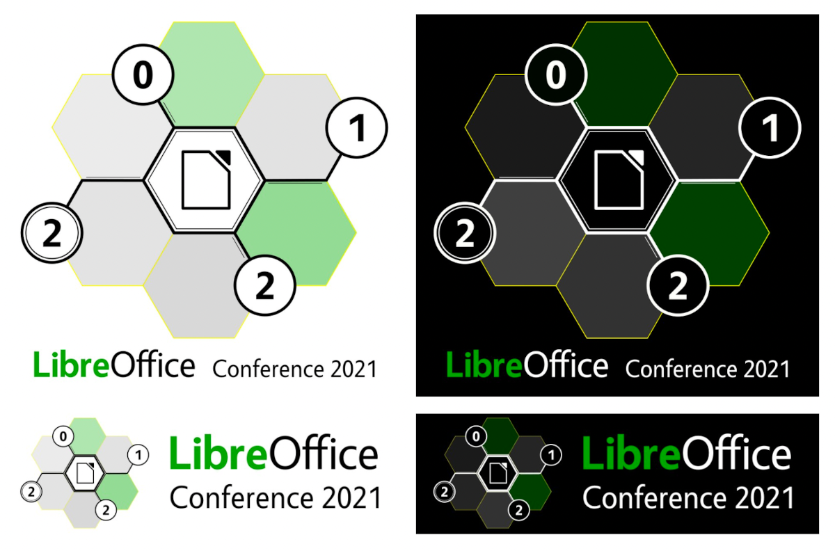
The conference organisers examined every design and ranked them, and today we’re announcing the winner, which is created by Alan Ward. Here’s how it looks:

Alan also provided a simplified monochrome version which can be used on merchandise – stay tuned to this blog for more on that. And here’s what he had to say about the design:
This design is inspired by the theme of a community coming together to share common experience. The hexagonal grid motif suggests networking from a technical and a human standpoint. The viewer’s attention is drawn to the LibreOffice emblem, as a focal point in the center. Colors have been chosen from a palette derived from the official LibreOffice typography, to suit both light and dark backgrounds.
Several versions of the logo have been prepared, to suit different applications. These include both full color and monochrome versions, in both hi and low resolution. High resolution printing process can reproduce thinner lines correctly (eg printed documents, PDF files). However, the use of several colors increases production costs or may not be available, so a simple monochrome may be required as an alternative to full-color. Either color or monochrome hires versions of the logo may easily be adapted as a base for a themed wallpaper.
Low-resolution printing processes such as those used to print T-shirts or engrave metal or wood articles require the use of relatively bold lines to show up correctly on the finished product. This is why a simple design with few elements is most effective in this situation. The use of several colors also increases production costs, so a simple monochrome approach is perhaps best for these applications. The monochrome design can easily be adapted for different colors of the support material (e.g. T-shirts in white, gray, black).
Thanks again to Alan for his design – a magic box of LibreOffice goodies is on his way to him! And thanks to everyone else for their submissions (we’ll get in touch and send you some LibreOffice stickers). Even though we had to choose one design in the end, there were plenty of great and creative ideas, and we really appreciate the input.
Now, onwards and upwards to the conference! Keep an eye on this blog for more updates…

Congratulations, LibreOffice and Alan!
Congratulations🎉🎉🎉 Alan! Great work!!
Congratulations Alan. A perfect logo for a opensource project.