
With free and open source software, you get back control – over your software, your data, and your computer as a whole. And in the LibreOffice community, we strive to create the best user experience, but we also recognise that different users have different requirements.
To this end, LibreOffice includes three main user interface designs, accessible via View > Toolbar Layout in the menu. Let’s go through them…
The first layout, Default, is what you see when you first install LibreOffice:
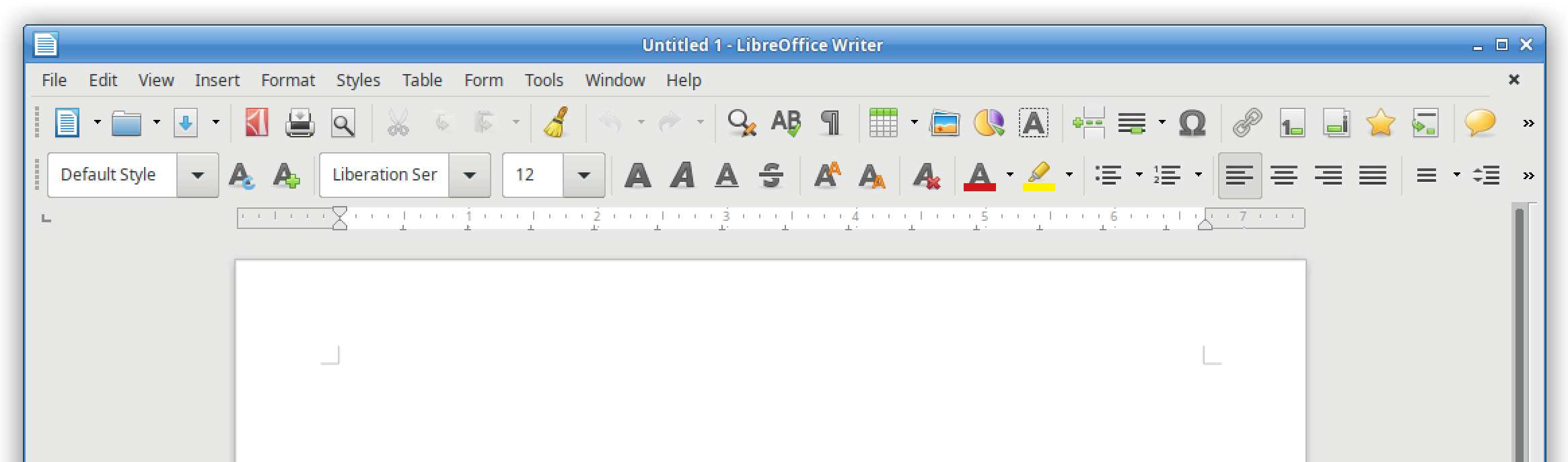
It’s a familiar layout with two toolbars containing various buttons. (Note that you can customise and add buttons to the toolbars if desired.)
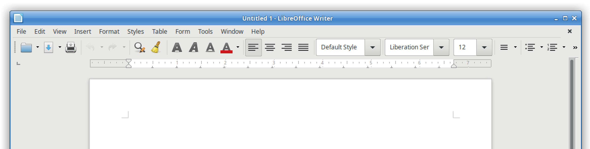
Then there is the single mode, which opts for simplicity and minimalism, giving you more screen space to really focus on your content:
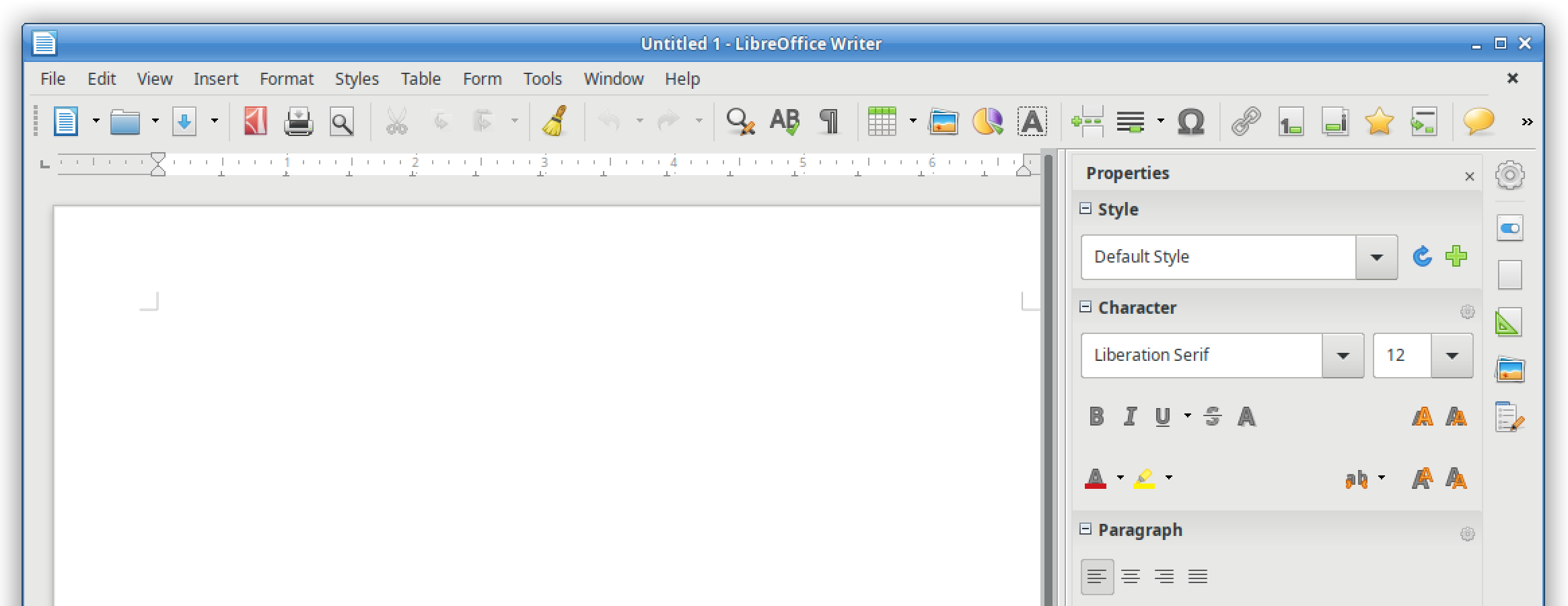
And finally, the third option is the sidebar, which uses horizontal space to provide buttons and options for your work:
So LibreOffice gives you the freedom and flexibility to choose the right interface for you. But we’re not finished yet! Our design community is working on the Notebookbar, another (optional) user interface:
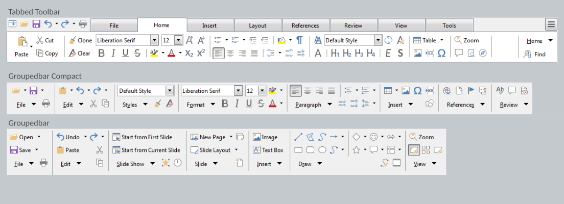
It’s still experimental, but you can try it out and help us to improve it, so that we can polish it up and include it in future releases! Join our design community to provide feedback – and thank you!
Wow, very glad the traditional model has not been abandoned, default or single mode with the sidebar is nice. hope keep this in future. I am often feel confused in MS office style(top panel).
Ditto the above. I go for simple every time.
It’s great to see progress, however the notebook bar first was made public in the LibreOffice 5.3 release. So a little over a year and a half now.
Is there any indication how long the experimental tag will remain? Perhaps I am being short sighted but if it has been tested for this amount of time why isn’t it an easily selectable option by now?
Also is there plans to add the missing icons in to the tabbed view? Currently the notebook bar looks very amateurish. I understand that testing is required etc but compared to something like WPS Office, Softmaker office then LibreOffice is lacking.
This is not a criticism but an observation as a long term user and fan of LibreOffice.
Hi Jim, the short answer is: it’ll be ready when it’s ready! LibreOffice is a volunteer-driven, community open source project, so the more help we get, the better. The Notebookbar is getting better, but needs more volunteers to improve it and test – so why not lend a hand? Join us here: https://wiki.documentfoundation.org/Design – thanks!