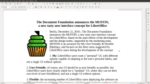
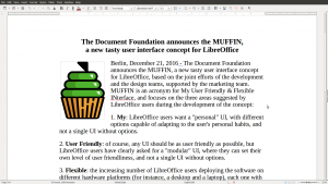
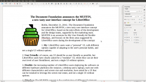
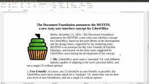
 Berlin, December 21, 2016 – The Document Foundation announces the MUFFIN, a new tasty user interface concept for LibreOffice, based on the joint efforts of the development and the design teams, supported by the marketing team. MUFFIN is an acronym for My User Friendly & Flexible INterface, and focuses on the three areas suggested by LibreOffice users during the development of the concept:
- My: LibreOffice users want a “personal” UI, with different options capable of adapting to the user’s personal habits, and not a single UI without options.
-
User Friendly: of course, any UI should be as user friendly as possible, but LibreOffice users have clearly asked for a “modular” UI, where they can set their own level of user friendliness, and not a single UI without options.
-
Flexible: the increasing number of LibreOffice users deploying the software on different hardware platforms (for instance, a desktop and a laptop), each one with different characteristics and screen size and resolution, have asked for a UI that can be tweaked to leverage the screen real estate, and not a single UI without options.
INterface: The MUFFIN concept is the combination of different UI elements, which are going to be available starting from LibreOffice 5.3 either as a standard or experimental feature: the Default UI (with toolbars), a Single Toolbar UI, the Sidebar with a Single Toolbar, and the new Notebookbar (experimental, and not recommended for production use). Each UI layout has been thought to serve a different cluster of LibreOffice users.


The rationale behind the MUFFIN is further explained in a marketing backgrounder [PDF] and in a specific blog post on TDF Design Blog.

29 thoughts on “The Document Foundation announces the MUFFIN, a new tasty user interface concept for LibreOffice”
Comments are closed.