

On Monday we talked to Heiko Tietze who is LibreOffice’s user experience (UX) mentor, and today we’re going to look at some changes that the Design team has implemented in recent releases of the suite. You can see how new features are implemented to make them accessible without drastically changing the overall design of the software.
Single toolbar mode
In LibreOffice 5.2, Writer and Calc received new single toolbar modes. These provide alternatives to the default double toolbar configuration, and save screen space while helping users to really focus on their work. Click here to see the initial discussion and mockups that led to this design change.
Currency drop-down button
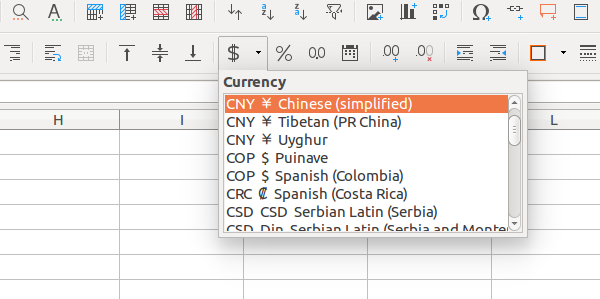
Here’s an example of a user interface change that barely takes up any screen space, but has a big impact on overall usability. Before LibreOffice 5.2, a single toolbar button was available for setting a currency format, but this button now has a drop-down menu to change between currencies. This only adds a few pixels on to the width of the toolbar, but it means users can quickly switch currencies without having to go into the menus.
Fine-tuning control points
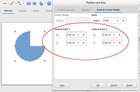
It’s often useful to add multiple ways to achieve something, providing they don’t add clutter or too much redundancy. Take working with enhanced shapes, for instance: before LibreOffice 5.1, users customised shapes using the mouse on yellow handles and control points. But after 5.1, it’s possible to manipulate the exact positions of those control points with numbers. So some users will still prefer to do it manually with the mouse, but those who need exact position have the option as well.
Spreadsheet function tooltips
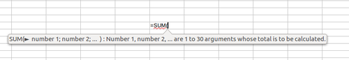
Some user interface changes aren’t just about making features accessible or speeding up workflows, but also making the software more intuitive. LibreOffice 5.2 introduced tooltips for functions in Calc, so that users can get a quick overview of what they do whilst typing them. This helps newcomers to get familiar with the software and reminds experienced users of what a function does without having to go through the help system.
Feedback from the design team – and have your say
The Design team strives to communicate its changes clearly and effectively to the wider LibreOffice community, and maintains a blog for this purpose. So if you’ve ever spotted a difference in the user interface between LibreOffice releases and you’re not sure why it happened, it’s worth reading the blog to get an explanation.
For instance, here are some recent blog posts describing the background to changes in recent and coming releases:
- Why the menus were changed in LibreOffice 5.1
- How Draw is being utilized
- And how Draw is expected to evolve
- Feedback from the community about the sidebar
The blog is also used to propose changes and get feedback. If you have an opinion on something, let the team know in the comments! Here are some recent posts:
- How the Navigator may support object handling in LibreOffice Draw
- How to handle inserting and playback of online media
- Dealing with missing fonts
That’s it for today – join us on Friday when we’ll show you how to get involved with the Design team and help to make LibreOffice’s interface better with every release.
2 thoughts on “Community Week: Design – recent changes, and communication”
Comments are closed.