LibreOffice is getting a shiny new website! We’re still working on it, and everyone interested in testing and helping out can join our mailing list for updates.
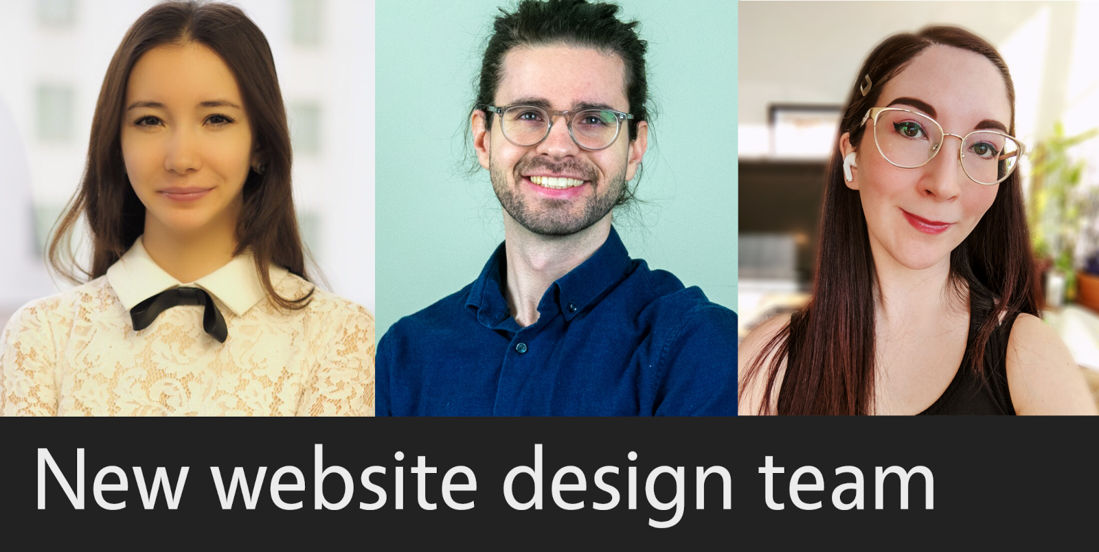
But today, we’re talking to the team who created the new design. Say hello to Dan Gallagher, Cat de Leon, Irene Geller, Helen Tran and Zarema Ross. Together, they identified needs and use cases for the website, created mockups, and then moved on to more concrete designs. Let’s see what they have to say…
Tell us a bit about yourselves!
Dan Gallagher: I’m a UX Designer coming from a background in psychology and education. I’m interested in creating intuitive designs based on human psychology. I’m currently living in Chicago, IL. In my free time, I like to box, make music, or play Dungeons and Dragons.
Cat de Leon: My name is Cat and I’m from the San Francisco Bay Area. I have an untraditional background, having majored in math in college, worked in higher education as an institutional researcher, and recently worked as a social media manager. Luckily, I’ve found my dream job in product design! If I’m not designing, I’m probably eating good food, playing video games, playing tennis, watching NBA games, or working out. I will never reject an opportunity to see a picture of your pet. 🙂
Irene Geller: I’m a digital designer from New Jersey (USA) with a focus on UI, visual assets, and branding at the moment. But I began my creative life as a traditional artist, just painting, drawing, and teaching others, too!
Helen Tran: I’m from San Francisco, California. My hobbies include finding scenic sights and building on my UX Research career on the side. I’m a killer for awesome views!
Zarema Ross: Originally I’m from Russia. Today, I live and work in the USA as a UX designer. Before my career in design, I finished an MS in Economics and Management, conducted market research, analysis, and built strategies in the oil and gas industry. I’ve led 10 subsidiaries, approved budgets, and was involved in financial planning.
Being skilled in turning data into actionable information to improve business results, andbeing passionate about solving problems, I end up becoming a User Experience Designer. I get my inspiration from my hobbies such as traveling, Russian ballet, Broadway shows, contemporary art galleries, and digital trends (AR, VR, etc.).
I consider myself a dreamer and a futurist. I hope new technologies will bring enhancements into our everyday lives, and will offer the opportunity to all people around the world to use them. That is why today, I’m working on different UX design projects, helping the world become a better place.

New banner for the front page
How did you get involved in the LibreOffice website redesign project?
Dan Gallagher: I was connected with a member of the website redesign project through a friend. We hopped on a video call and discussed the project, and it sounded like a great opportunity! I had used LibreOffice before, and I really like the idea of giving free office tools away to anyone.
Cat de Leon: I was recruited by Christine Louie and Lisa Lin who did the initial research for LibreOffice’s redesign project. They brought on a team of designers and researchers to continue their work and bring their concepts to life.
Irene Geller: During the 2020 pandemic year, I attended several webinars about UX/UI, to keep myself occupied, fresh on industry knowledge, and to be quite honest, sane. Apparently, at one of these webinars- we don’t even remember which one!- I had connected with Christine Louie (who is now a UX Researcher at Facebook). I must have made a positive impression in the live comments section, because some time after the webinar, Christine reached out to me about volunteering to assist with LibreOffice’s website redesign project. Since I was already a user of LibreOffice in my day-to-day life, I thought it would be an interesting project to take on!
Helen Tran: I met Christine, who was the lead UX Researcher, through a webinar – and after getting to know each other she reached out to me for this amazing opportunity to join the LibreOffice website redesign project. I got to meet the rest of the team which included Lisa, Dan, Cat, Zarema, and Irene who were also all a pleasure to work with. Thanks to everyone who contributed as this team and the team at LibreOffice made this project such a success! 🙂
Zarema Ross: I was invited into the project by one of my colleagues from the UX bootcamp I went to. I liked LibreOffice’s mission to support the community and develop software that everyone can use. I’ve met an amazing team of software developers and UX designers. I really enjoyed working on the project, as it was well organized, and I had a chance to collaborate with cross-functional teams from software developers to the marketing team, as well as run workshops with them in order to improve the information architecture.

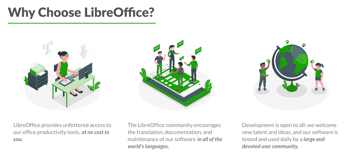
New graphics and cleaner design
What particular aspects did you work on, and what was it like?
Dan Gallagher: I focused more on the sketching, wireframing, and documentation of the project. It was my first time working on a team of designers and researchers – it was amazing to be able to share my work and get feedback at every stage of the design process. Every call, someone suggested something I wouldn’t have thought of if I were working alone. I was fortunate to be on a team of skilled and dedicated designers!
Cat de Leon: Before this project, I have only done solo projects so working with a team has been absolutely fantastic. I’ve enjoyed every conversation and meeting I’ve had with this team and I hope to continue our relationships after we’re all done here. I’ve also thoroughly enjoyed connecting with our stakeholders all over the world, like Ilmari, Heiko, and Mike! Our team would probably agree that we’ve gotten far more well versed in time zones after this project. 🙂
Irene Geller: I helped with creating high fidelity UI designs that captured our stakeholders’ key goals for various webpage designs. However, the best part of this project wasn’t working as an individual designer – but as a team!
We used Figma for all of our design work, which allows multiple users to collaboratively work on a design, in real-time. That was a new experience for me as I usually work as a “design team of one”. I found that we often came up with our best ideas when we worked together!
For example, one time we met up to look over the page designs that Cat, Dan, and Zarema had completed. I immediately saw which elements worked best in each approach (ie what fit the stakeholders’ goals best), and quickly combined them together in one new page design, with adjustments to make it all cohesive. Everyone responded positively, so we spent the remainder of the meeting polishing all the elements of this new design. When we presented it at our next stakeholder meeting, they absolutely loved it – an immediate success! That showed me the power of collaborative design.
Overall, it was a real pleasure to work with such talented and smart individuals for a good cause. It certainly made the pandemic lockdown a little brighter, too!
Helen Tran: I worked as a UX Researcher for this project. I helped recruit participants, ran usability tests, and interpreted data to test the projected website launches. It was an amazing experience! It was definitely enjoyable to see the combined efforts made by everyone on this team go into play during the usability runs to witness how individuals engaged with the various features. This experience was rewarding from start to finish seeing the behind the scenes work to a polished website based on all of our hard efforts.
Zarema Ross: Working within an international team of UX designers and Software developers (in the USA and Germany), I:
- Led design workshops with cross-functional teams to explore innovative solutions for problems and opportunities identified through research and data
- Performed content audit, validated the SiteMap, restructured the information architecture
- Sketched designs, created low and hi-fi mockups
- Iterated on designs and performed usability testing
- Contributed and maintained the UI kit and style guides
At the end of the day, it was teamwork that drove us to the results we have. I would like to say special thanks to our UX design team: Helen Tran – the time we spent on usability testing, deriving the insights from the research; Dan Gallagher, Cat de Leon and Irene Geller- for the brainstorming we did together, going from lo-fi to hi-fi designs.

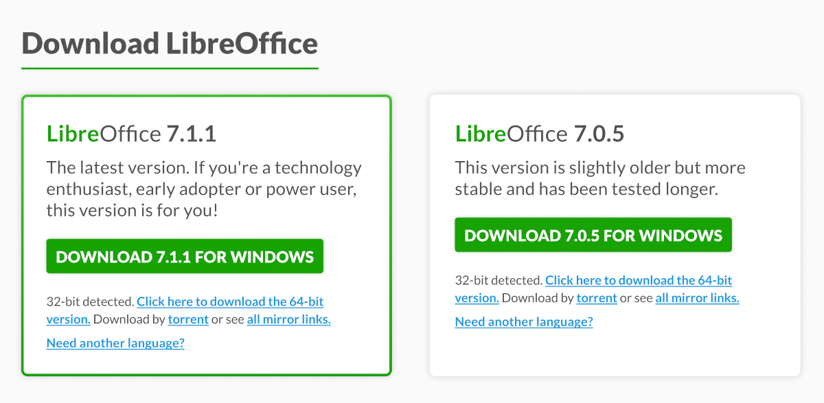
And a redesigned download page
What are you interested in doing next?
Dan Gallagher: I’ll continue freelancing, working on personal projects, and searching for a full-time job. Working on this project was a great experience to highlight on my resume, it shows I work well within a team and can balance user and business needs!
Cat de Leon: Now I’m a product Designer for CaaStle. And I just know that wherever I go in future, I’ll be solving users’ problems to the best of my product design abilities and I’ll be having a blast doing it. Thank you so much for this opportunity, LibreOffice!
Helen Tran: I’m interested in growing my UX Research career! I’m ready to dive deep and hop along new projects to learn and enhance my UX skills. Hoping for many more grateful experiences like this project! 🙂
Zarema Ross: I’m interested in the topic of accessibility and inclusive design. I’m currently working on Accessifier which is a crowdsourced web app that provides accessibility ratings of specific apps for users with accessibility needs. I also do UX design on a freelance basis. And I’m looking forward to collaborating with new people, exchange knowledge and create impactful designs. Here’s my LinkedIn page.
Many thanks again to the whole team for their work! And as mentioned, anyone can join our website mailing list to help us to finalise, test and promote the new website. Let’s make it happen together!

Thank you for the fabulous work! Looking forward to seeing it live. 🙂
The PROBLEM that I have with LibreOffice is that ALL of the content is written for computer programmers. NOTHING is presented in HUMAN language.
I mean that, even when your daily “tip” comes up, I have no idea what the “tip” means.
This because I ONLY speak, read, and write, in HUMAN English.
Your computer programmers have forgotten that maybe 95% of your users do NOT
have five, or ten, year, computer programming degrees.
This is why LibreWriter and LibreOffice, have only a limited user base.
It is because millions of people, such as myself, have NO programming degrees,
so, when the computer says “something”, we just click where it SAYS to.
IF you want more customers, then you need to look at WordPerfect, from Windows.
Atleast windows uses more HUMAN speech than you do.
It took me three, full, days just to find out how to “save” documents, to my flash drive,
from Libre. Another five days just to figure out how to close documents, and free up
space, on your “one drive”?
Libre is a complete nightmare for anyone who has NOT received a degree, in computer programming.
Hi Norman, we don’t have “customers” – we’re not a company. We’re a volunteer-driven, community open source project, backed by a small non-profit. OneDrive isn’t from us, and the process of saving to a flash drive is dependent on the operating system, not directly LibreOffice itself. You say we have a limited user base, but we have over 200 million users around the world! Sorry to hear that you find it difficult, but our volunteers work very hard on documentation and other tutorials: https://documentation.libreoffice.org/en/english-documentation/ – If you think something isn’t explained well, please contribute back and give them a hand to improve it!
Good luck
Thank you for your teamwork on this project. Really appreciate the software.
Could LibreOffice Online Draw component be used instead of Figma? Thank you
Thanks very much. I use LibreOffice for all my documentation. Yes, I hope to see a better website. There is always a better way
One of the things (of many) I like about LibreOffice is that it’s not so heavily abstracted as some other office products. There’s less fluff between me and getting my work done. It’s not perfect but neither am I.
Great job!
By the way, I’m not a programmer and don’t have 10 years of computer training. 🙂
This was a great read. Some interesting and diverse experience from you all. A bright future for LibreOffice and it’s fans. Best wishes!
Why did they spend money on redesigning their website when it’s the software itself that needs a complete overhaul. LO may have the most features of any free office suite, but it’s also the ugliest by far. Whenever you approach a developer about this they claim that there’s nothing wrong with the UX, and it “is designed to ISO xxx standard and works in 700 languages”. So what! It’s still very ugly.
As a writer I want a nice, aesthetically pleasing interface surrounding the page while I type. Seems the computer programmers never seem to give much thought to that, or perhaps they scared all the graphics designers away.
Hi, you write about “spending money on redesigning the website” but if you read the interview, you’ll see that the designers are volunteers. Also, there is ongoing work by other volunteers in the community to refine and improve the user interface: https://wiki.documentfoundation.org/Design – But everyone has different needs. If you’re not happy, you can contribute back and help them to improve the design!
Excellent job!
I love the new look!
It’s always important to not overwhelm a new user with gobs and gobs of information that 99% of them won’t use. And the site definitely needed a re-think.
Good luck in the future to all of you!
Without a doubt, a great contribution to the user community that we love Libreoffice. Congratulations to all of you for your excellent work. Greetings from Ecuador!!
Problem with saving files from LibreOffice if computer shuts down unexpectedly. They used to offer one the opportunity to fix it; now that fix is not available. What happened to it!?
LibreOffice saves the document to disk on a regular basis, and if something wrong happens offers the possibility of recovering the file up to the last save. If this doesn’t happen, either the crash happened before the periodical save (which is possible), or the periodical save has been disabled by the user (as the default is ON).
It appears that my previous comment was deleted, since I saw it was here for a period of time and then it was gone when I checked again later. I’m sorry, but I must ask why is that? My comment wasn’t offensive at all and if someone can’t handle criticism they won’t be able to get better at what they do.
The term you used was totally inappropriate for comments here. It had nothing to do with the criticism you made.