Community Week: Design – recent changes, and communication

LibreOffice Community Weeks

On Monday we talked to Heiko Tietze who is LibreOffice’s user experience (UX) mentor, and today we’re going to look at some changes that the Design team has implemented in recent releases of the suite. You can see how new features are implemented to make them accessible without drastically changing the overall design of the software.

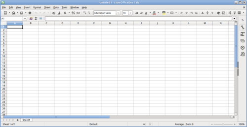
Single toolbar mode

In LibreOffice 5.2, Writer and Calc received new single toolbar modes. These provide alternatives to the default double toolbar configuration, and save screen space while helping users to really focus on their work. Click here to see the initial discussion and mockups that led to this design change.

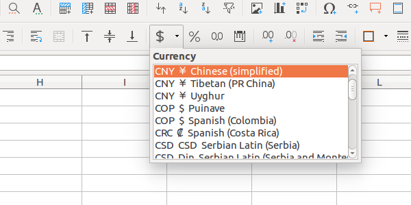
Currency drop-down button

Here’s an example of a user interface change that barely takes up any screen space, but has a big impact on overall usability. Before LibreOffice 5.2, a single toolbar button was available for setting a currency format, but this button now has a drop-down menu to change between currencies. This only adds a few pixels on to the width of the toolbar, but it means users can quickly switch currencies without having to go into the menus.

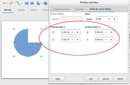
Fine-tuning control points

It’s often useful to add multiple ways to achieve something, providing they don’t add clutter or too much redundancy. Take working with enhanced shapes, for instance: before LibreOffice 5.1, users customised shapes using the mouse on yellow handles and control points. But after 5.1, it’s possible to manipulate the exact positions of those control points with numbers. So some users will still prefer to do it manually with the mouse, but those who need exact position have the option as well.

Spreadsheet function tooltips

Some user interface changes aren’t just about making features accessible or speeding up workflows, but also making the software more intuitive. LibreOffice 5.2 introduced tooltips for functions in Calc, so that users can get a quick overview of what they do whilst typing them. This helps newcomers to get familiar with the software and reminds experienced users of what a function does without having to go through the help system.


Feedback from the design team – and have your say

The Design team strives to communicate its changes clearly and effectively to the wider LibreOffice community, and maintains a blog for this purpose. So if you’ve ever spotted a difference in the user interface between LibreOffice releases and you’re not sure why it happened, it’s worth reading the blog to get an explanation.

For instance, here are some recent blog posts describing the background to changes in recent and coming releases:

The blog is also used to propose changes and get feedback. If you have an opinion on something, let the team know in the comments! Here are some recent posts:

That’s it for today – join us on Friday when we’ll show you how to get involved with the Design team and help to make LibreOffice’s interface better with every release.

Community Weeks: Design – meet the team

LibreOffice Community Weeks

We now come to our final Community Week for October 2016, and this time we’re talking to the Design team. Design is an essential aspect of LibreOffice development, and it’s sometimes tough to find the right balance: some users want the interface to change rapidly with each release, whereas others are more conservative and prefer an incremental approach. When new features are added to LibreOffice, they must be made accessible and easy to find, but not interfere with the workflow of experienced users.

The Document Foundation, the non-profit entity behind LibreOffice, has a dedicated user experience mentor: Heiko Tietze. He works with the Design team to research and implement user interface improvements, trying to take into account the needs and wishes of as many users as possible. We caught up with Heiko to see what he’s working on at the moment…

Heiko Tietze LibreOffice developer

What is your role in the Design team?

I’m the user experience (UX) mentor and my role is to support and facilitate work on the user interface (UI) of LibreOffice – how it looks and behaves. This includes giving my advice on Bugzilla tickets with the needsUXEval keyword, conducting surveys and quick polls, working on and publishing proposals on the design blog, managing weekly design meetings, defining human interface guidelines (HIG), creating prototypes, etc. In general, my task is to get more people involved.

How did you first get involved with LibreOffice?

In the 1990s I studied psychology with a focus on methodology and statistics. Scientific experiments typically end up with a mass of data, so getting familiar with programming is a big plus – which brought me towards usability. Some years ago I volunteered with a couple of tests about the icons used in LibreOffice.

Later on this moved forward to more advanced studies on how users deal with the product and what they expect (find all blog posts here). And finally The Document Foundation made a tender last year for a freelancer for UX and design work, and I was picked for it.

What does your typical workday look like?

Usability is about users, so basically I observe, talk, interview, watch videos, and read comments to get an impression of what our users need. My day starts with reading emails – typically a lot come in from the ux-advice mailing list. Commenting can often take some time when a ticket is not clear in respect to the workflow.

When working on a new UI design I start by researching the issue and collecting all the requirements first, and then I scribble mockups that follow our principles of simplicity, consistency, and ease of use. While this might sound straightforward, it isn’t always so. Usability is an iterative process where everything needs to be discussed and improved repeatedly. If you want to learn more about the work of the design team read “How we work” on the wiki.

What areas in Design are working well, and what needs to be improved?

Regarding the team, we are doing pretty well in my opinion. There is always room for improvement and we need to be faster with decisions on UX-related tickets. But that’s how open source works, slowly. And regarding the application, I believe we need to improve on simplicity and clear concepts. There are numerous functions for special workflows that hinder beginners. And on the other hand we have a lot of hidden gems that even experts never use.

Who else is involved and what do they do?

The design team has many contributors who are experts from different areas including members of the development team. Some spend a lot of their spare time committing patches for menus or UI files, while others work on small aspects such as visual design or icons. Find a list of members see this wiki page.

How can regular (non-developer) LibreOffice users help out?

Everyone is an artist, and everyone is a user. The simplest way to contribute to LibreOffice is to file bugs and submit enhancement requests to our bug tracker. For those who want to do more, we have tasks for the very beginner (eg assign nice names to colors, create custom shapes), for experienced UX/UI designers (eg revamp the bibliography dialog), and for advanced developers (typically Google Summer of Code students). On our wiki we list the topics so everyone can get an impression about the demands: click here for all the details.

Finally, we’re currently running a survey asking users how LibreOffice should handle missing fonts. It would be great if LibreOffice users could read the survey and choose whether they like the change or not in the form at the bottom.

Thanks Heiko. Coming up later in the week, we’ll explore in further detail what the Design team does, and show you some more ways to get involved.

Contribute to LibreOffice 5.0 with a brand new Impress Template

LibreOffice Design Team launches a competition to increase the number of Impress templates bundled with the upcoming Libreoffice 5.0, due in early August 2015. The competition is open to designers, artists and creatively talented users.

The project is focused on Impress templates, as this is the primary place where templates are needed. As Impress templates do not contain text, they can be included in all language versions without the need of translation.

Deadline for submission of new Templates is July 18, 2015, to be included in LibreOffice 5.0. Works submitted after this deadline will be added to the next LibreOffice release.

Templates will be selected by the members of the LibreOffice Design Team, and may be edited before the inclusion. Authors will be credited on http://www.libreoffice.org/about-us/credits/.

To be considered for inclusion, templates must meet the following conditions:

  • They are an original work, and are not converted from existing templates.
  • They are licensed under Creative Commons CC0.
  • They are templates for LibreOffice Impress and contain two or more master slides.
  • They are based only on fonts bundled with LibreOffice (Caladea, Carlito, DejaVu, Gentium, Liberation, Libertine G, Open Sans, PT Serif, Source Code, Source Sans).
  • They contain no text, including no text in images, as they are intended to be used in any language without the need for translation.
  • They are based on LibreOffice styles, and not on direct element formatting. Styles must be created according to the expected use of the template.

For more information about creating templates, please check here: and here: http://lodahl.blogspot.ae/2014/12/making-good-and-solid-templates.html.

The submission page for the new Impress templates, with all details, is here: https://wiki.documentfoundation.org/Design/Whiteboards/Templates_for_LibreOffice_5.0.

Be creative ! We look forward to bundle your template designs !