
It has become a commonplace to describe the Microsoft 365 Ribbon as the finest office interface available — the most polished to look at and the most ergonomic to use. The claim is repeated so often that it tends to pass unexamined. It deserves examining, because hidden inside it is an assumption that quietly does most of the work: the idea that there exists a single best interface at all.
A competent design — for one kind of user
Let us begin by granting what is true. The Ribbon is a capable piece of design. It was built to help an occasional or intermediate user discover features by browsing rather than by memorising, and for that user it does its job well. Saying so is not a concession wrung out reluctantly; it is simply accurate, and any honest discussion should start there.
But “well-designed for a particular user” is not the same thing as “best interface,” and treating the two as equivalent is where the reasoning slips. An interface optimised for one persona is, by construction, less suited to the others: the power user who works from the keyboard and resents losing vertical screen space, the migrating user carrying twenty years of muscle memory, the user who depends on assistive technology, the user on a small or low-resolution display. A single fixed layout cannot be best for all of them at once. It can only be best for some, at the expense of the rest.
Ergonomics is a trade-off, not a verdict
The same applies to the ergonomic claim, only more sharply, because ergonomics is something one measures rather than asserts. The research on interface efficiency is consistent on one point: how well an interface performs depends on the task, its frequency, and the expertise of the person doing it. Discoverability and raw throughput pull in opposite directions. An interface that makes features easy to find for a newcomer is rarely the one that lets an expert move fastest, and the reverse is equally true.
So the Ribbon makes a trade. It spends vertical screen space and a measure of expert speed to buy browsability for the less frequent user. That is a perfectly reasonable bargain — for the people it was struck on behalf of. Calling it “the best ergonomics,” though, simply declines to name what was given up to get there. There is no free lunch in interface design; there is only a choice about who pays.
The real question: who decides?
This brings us to the point that actually matters. When a product ships a single interface, it has made the ergonomic decision on the user’s behalf and removed it from their hands. The trade-off still exists — it has merely been settled by someone else, once, for everyone.
LibreOffice takes the opposite path. It offers the traditional menu-and-toolbar layout, the Tabbed interface, Tabbed Compact, the Groupedbar, a Sidebar, and a Single Toolbar mode, and it lets each user choose the one that fits their work, their hardware, and their habits. This is not a substitute for a “real” Ribbon, nor an apology for the lack of one. It is the more mature answer to the ergonomic question, for a simple reason: the only person who can properly weigh these trade-offs is the one actually performing the task. Choice is not the consolation prize. Choice is the point.
What 26.8 changes, and what it does not
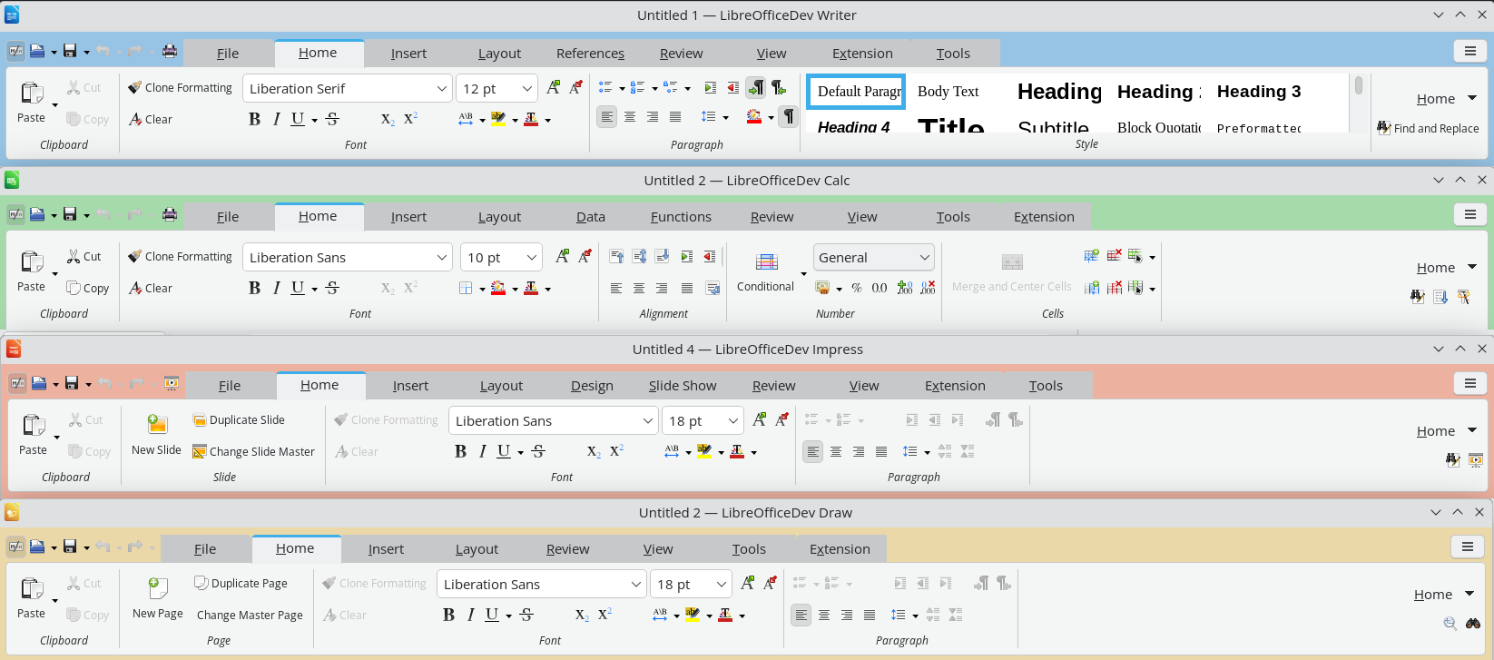 LibreOffice 26.8 will bring an improved Tabbed interface — the layout closest in spirit to the Ribbon. It is worth being precise about what this means, because it is easy to misread. The improvement widens the range of good options; it does not narrow it. It is emphatically not an admission that the menu-based interface was lacking, nor a signal that it is on its way out.
The traditional menu-and-toolbar interface remains a fully supported, first-class choice, and it will not be deprecated. An ecosystem that adds options without taking any away is the exact opposite of one that imposes a single layout and asks everyone to adapt. Adding a better Tabbed interface while keeping the classic one intact is not a contradiction. It is the whole philosophy, working as intended.
The same principle, one layer down
This approach to the interface is not an isolated quirk. It is the same principle that governs how LibreOffice treats document formats, and the parallel is worth drawing out, because it reveals a consistent way of thinking about who software is meant to serve.
LibreOffice adopts the open standard, the OpenDocument Format, as its native format — the one it reads and writes by default, without compromise. At the same time it continues, release after release, to improve its support for the proprietary formats, so that users who must exchange files with others are served as well as the technology allows. The standard comes first; support for the proprietary follows, and keeps getting better, because that is what users need.
Set this beside the other approach and the contrast is stark. There, support for the open standard is present but kept deliberately limited — limited by choice, not by capability — while the proprietary format remains the privileged default. One model treats the open standard as the foundation and works continuously to serve the user across every format they encounter. The other treats the standard as a box to be ticked and the user as someone to be kept in place.
It is the same pattern in both cases. On one side, a tool that fits itself to the user — in its interface and in its formats alike. On the other, a user asked to fit themselves to the tool. There is no best interface, only the one that fits; and the software that offers the most well-made ways to fit, rather than a single default decided in advance, is the one that takes the user most seriously.