 LibreOffice 6.2 is due to be released at the end of this month, and many communities in the project have been working hard on new features. Today we talk to Heiko Tietze, The Document Foundation’s UX designer, about the upcoming release…
What new feature(s) in LibreOffice 6.2 are you most excited about?
Two years ago, The Document Foundation announced the MUFFIN concept, that is supposed to give users the freedom to change the user interface to what they are familiar with, and to adopt to any usage scenarios. Now, with the upcoming LibreOffice 6.2 release, we finally made this feature available for everyone, not only the brave users who enable experimental features.
We present the “Tabbed” and “Groupedbar” variants in the first stage (View > User Interface in the menu). The Tabbed variant aims to provide a familiar interface for users coming from Microsoft Office. It is supposed to be used primarily without the sidebar. Here’s a quick animation of it in action:
Please confirm that you want to play a YouTube video. By accepting, you will be accessing content from YouTube, a service provided by an external third party.
If you accept this notice, your choice will be saved and the page will refresh.
Meanwhile, the Groupedbar design follows the mantra “Simple by default, powerful when needed” with the basic principle to access “first-level” functions with one click, and second-level functions with a maximum of two clicks.
What has the design community been working on in preparation for this release?
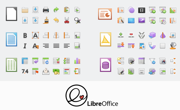
We also made massive changes and improvements to icon themes, in particular Elementary and Karasa Jaga. Here’s Elementary:

Plus, the icons are now shipped as SVG vector graphics. If the rendering is stable and accurate we plan to switch completely in one of the upcoming releases. Read more on the technical background on this blog.
Another great step ahead has been made regarding the personalization feature (Tools > Options) that took ages in the past to show results. Now it brings up the Firefox personas within a second or two. Read more about this here.
Looking further ahead, what else are you planning – or want to achieve – in the community?
We will continue the work on the Notebookbar variants. Some concepts are almost ready for publication. Ideally, users load the Notebookbar variants as an extension. And we are aware that a lot of work has to be done in this regards.
Other than that, we discuss the ideas from the community on a daily basis. Some would be great enhancements; others are probably not suited to an office suite. The evaluation of this input takes some resources. And last but not least, we have many “creaking doors” that might benefit from a redesign: bullets and numbering, outlines, bezier curves, bibliography…
So how can people get involved?
Everybody is welcome to join the design group. Most of us are active on Telegram and you can just lurk around there and listen. But your input on tickets on Bugzilla with keyword needsUXEval is also very welcome. We pick some of those topics and discuss it in the weekly meeting, biweekly either on Wednesday evening (7pm UTC) or Thursday afternoon (1pm UTC).
All information about who we are, how we work, and how to get in contact are provided on the LibreOffice wiki.
Thanks to Heiko and the whole design community for their great work. We’ll be talking to other communities over the next few weeks, so keep an eye on this blog for more…

I move to and from Word Perfect, Lotus spreadsheets and Libre. I wish you had a quick translations, especially to and from WP. It is a much more usable set of non-mainstream functions.
Looking forward to this very much indeed – have been a grateful daily Libre Office user for more than 10 years.
While I welcome any advancement in LibreOffice’s UI, I gotta say those new icons are pretty mediocre. Apart from stylistically looking like a relic from the 90s, the big problem is they’re so visually overwhelming. Compare the icons there to the ones in Google Docs or the latest release of Microsoft Word. In GDocs and Word, the icons are intentionally rendered quite simplistically so you can quickly identify what they do. These new icons are the opposite – there’s so much going on that it’s impossible to easily determine what they do, and when using the software, it makes it hard to find what you’re looking for quickly.
That’s just one icon theme – several of them are supplied with LibreOffice! Hopefully you’ll find one you like 🙂
Give the Sifr icon set a try. It’s my preferred icon set and I think it will be what you’re looking for.
Warning – Your buttons for Left Justify and Right Justify are reversed from where they are in 6.1, and badly located because of this…
Look what you have… the Right Justify button is on *left* (of Center), and the Left Justify button is on the *right* of Center. Again, this is exactly opposite of the layout in 6.1.
I’d really like to see this get corrected before release.
Hi Matt, they look totally fine for me in LibreOffice 6.2.0.1: https://i.imgur.com/dofnFZp.png – What exact version are you using, on which operating system? Have you done any toolbar customisation or added any extensions? You could try resetting your user profile: https://wiki.documentfoundation.org/UserProfile#Resolving_corruption
Can y’all do something about the launch times and resource usage? Compared to Microsoft Word, LibreOffice Writer launches a little bit slower and uses up 40 MB more RAM. I’d also like to see a new icon set (official or unofficial) based on the new Microsoft Office 2019/365 icons.
and no im not a southern american. im just a twitter user lmao
Hello, the memory usage under Microsoft Office seems to be lower, but that’s also because parts of that suite are hidden within the OS, and preloaded when you start Windows ; which can’t be for Libreoffice since LO works also under OSX or Linux.
I really like the Muffin interface since 6.1.2.4 and it’s exciting to test 6.2 right now. The new icons above are very gorgeous, I like them. Thank you Heiko, thank you Mike, thank you all LibreOffice developers. It is beautiful.