Design (UI and UX) has been one of the major focus points of LibreOffice in the last few years, and the Design community has produced new icon sets and a number of incremental updates to the user interface – menus, toolbars and the SideBar – along with improvements to the NotebookBar
(This is part of The Document Foundation’s Annual Report for 2022 – we’ll post the full version here soon.)
Improvements in LibreOffice 7.3
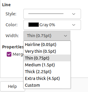
Several updates were done by LibreOffice’s design team. For instance, a larger change was implemented by Samuel Mehrbrodt and Vasily Melenchuk regarding the border style. The previously random line thickness options became organized with clearly defined names and reasonable steps.

Improvements in LibreOffice 7.4
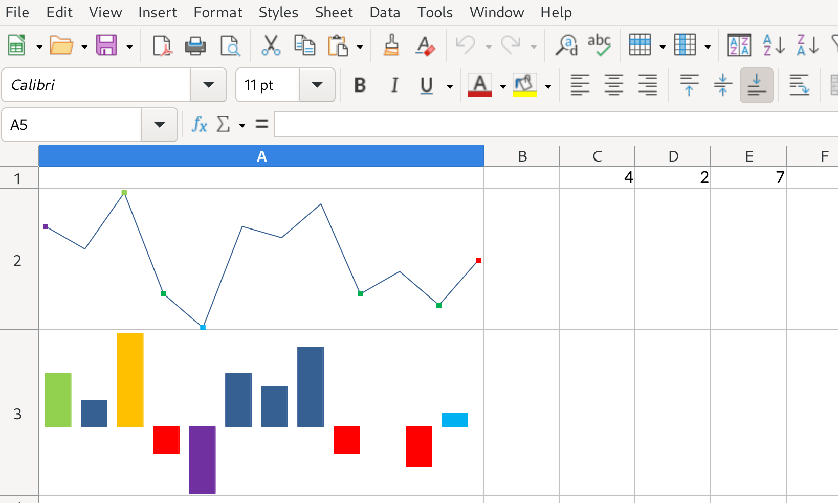
A large number of improvements were implemented in LibreOffice Calc. First of all, “sparklines” mini-charts were introduced by Tomaž Vajngerl, which allow users to place a diagram-like image in cells that visually shows numerical content. In addition, hidden columns/rows can now have an indicator: if enabled, a dotted line will be drawn next to the hidden content.

The sort options and sort items were made easier to access. While previously it was necessary to go to the sort options to change the sort direction and whether headers should be taken into account, these most frequently changed options are placed on the primary tab now.
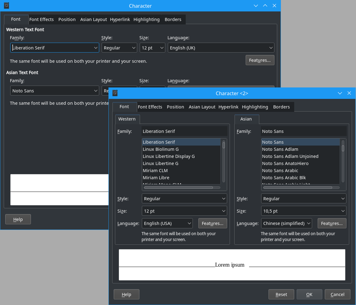
The font dialog was reworked to remain compact when Asian and/or complex languages are enabled. The design community aims for dialogs that work on very small screens too, and the font dialog was violating this rule. With the change, it now fits into the screen real estate, and allows to comfortably manipulate fonts for all language families.

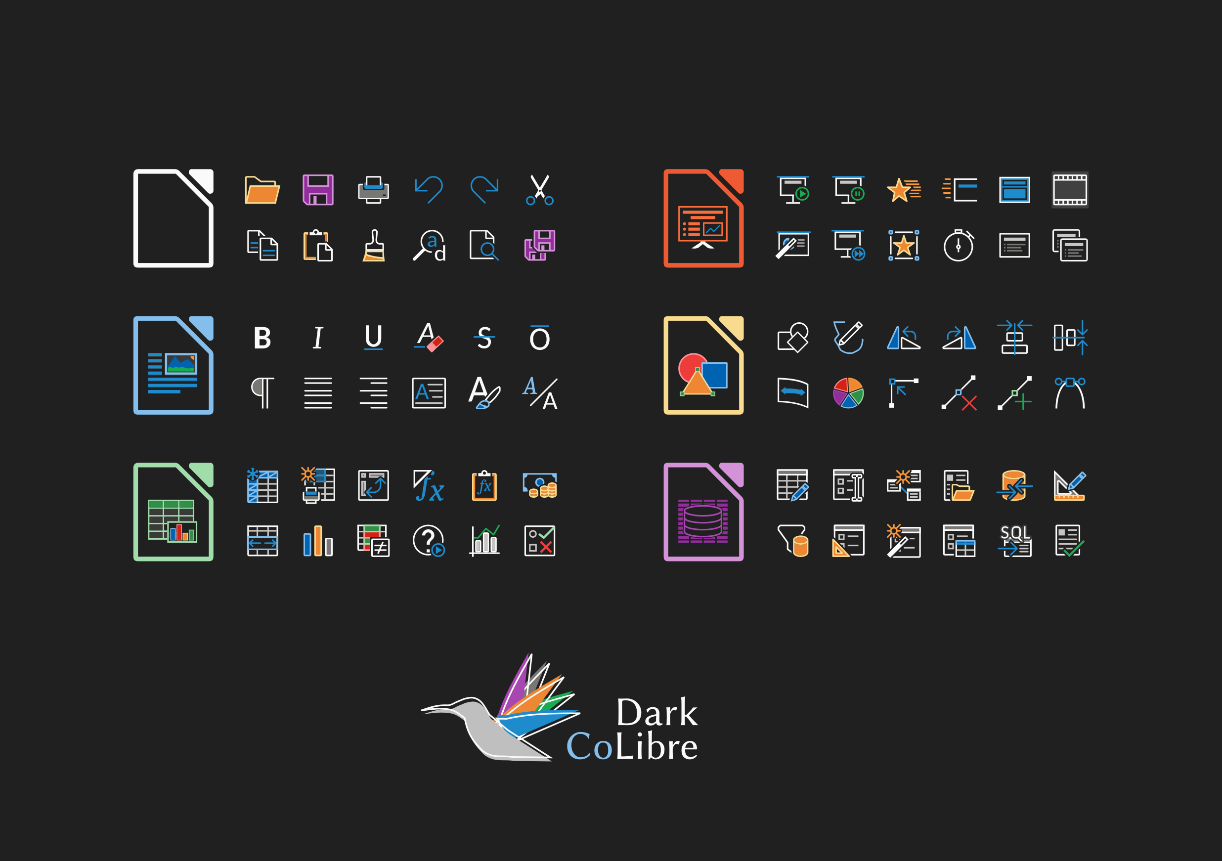
Finally, Rizal Muttaqin improved the Colibre icon theme, which is the default theme in Windows. It has now a dark variant working much better on dark system themes, while maintaining the monochrome color composition from Microsoft.
